

You won’t find most website redesigns have failed on account of an unattractive new look. No, they fail because the team made the mistake of treating a business issue as one of style. They put a designer to work before they knew what the site was supposed to do, gave their blessing to a homepage that wowed everyone in the room, and then had to look on as conversion and organic traffic nosedived while the publishing staff grumbled over a CMS that was needlessly more difficult than the last.
This guide is meant to put a stop to that kind of thing. If you want to go about a redesign without throwing away what is already working for you, you would be well advised to put aside your concerns for the visuals and focus on the hard stuff: the constraints, the evidence, and the few decisions that will determine if the project is worth it.
Decide Whether You Actually Need a Redesign
Start by asking yourself if a redesign is the answer at all. The numbers from Contentsquare’s 2025 digital experience benchmarks are telling: across the open web, overall website conversion has taken a 6.1% hit while acquisition costs are up 9%. That sort of pressure can make a team want to rebuild when the problem is actually more specific.
So before you scope anything, put some distance between three things that tend to get conflated: a brand that is looking its age, a site with poor performance, and a business that has evolved. They require different approaches.
- The looks are dated but it converts: Do a visual refresh and some template housekeeping. Don’t rebuild.
- The structure is fine but conversions are low: A UX and content fix on a few pages will do.
- The business has changed shape: New pricing, new audience, new operations or CMS needs. Then you have earned the budget for a redesign.
You will hear practitioners on X or Reddit put it bluntly. The refrain with big redesigns is always along the lines of “the UI is nicer but the UX has suffered.” Take Booking.com, for instance. They don’t do large untested overhauls; the ones in the past lost them money and were put back. Or look at GOV.UK, which has been able to consolidate hundreds of old sites by making redesign a matter of continuous iteration against service standards rather than some grand launch event.
The point isn’t to never redesign. It is that the existing site doesn’t have to prove itself; the redesign does. Unless you can put your finger on an operational or conversion problem the new site will address, you are just going to end up with a pricier version of what you have now. We go into more detail on when to iterate versus rebuild in our website redesign process guide.
Start With Constraints, Not Mockups
Think of a redesign as an engineering and content project with design thrown in. You should treat it as such right from the brief.
Before you let anyone start on the visuals, establish four constraints. They may seem dry, but they are what makes or breaks a redesign in terms of return.
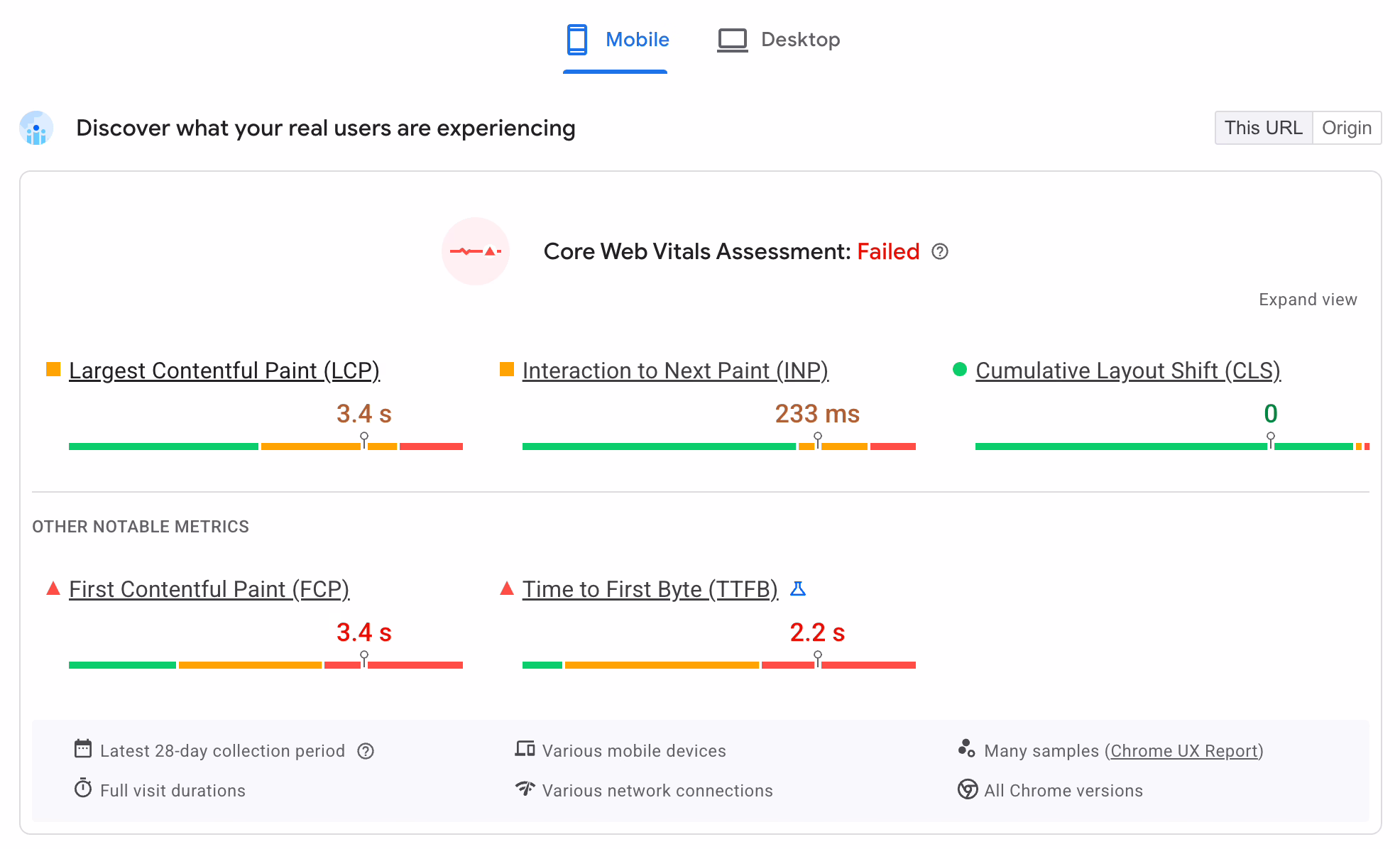
Performance budget
Get your targets in place first. Your baseline should be defensible, something like Google’s Core Web Vitals thresholds: Largest Contentful Paint below 2.5 seconds, minimal Cumulative Layout Shift, and low Interaction to Next Paint. Put a ceiling on page weight and a budget for JavaScript. And set some ground rules for third-party scripts. A hero section with a 4MB video and a trio of tracking pixels is not modern, no matter how it looks. It is a Core Web Vitals failure in waiting.
Accessibility baseline
Then there is accessibility. WCAG 2.2 AA is the de facto standard in law, finance, healthcare and the public sector, and you see it more in commercial work these days. According to Level Access research from 2025 (as Figma has reported), 75% of orgs now say it puts money in the till. If you leave it to the end, you will be rebuilding components. Designers ought to view contrast, keyboard navigation and form labels as part of the job, not something for developers to clean up.
SEO migration plan
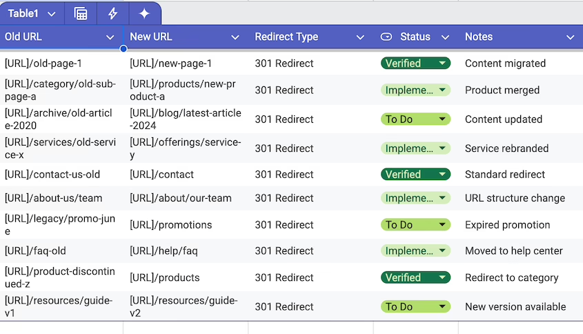
Most teams under-budget for this line item. But a new site is a migration. URLs and templates will change, internal links will be altered, and structured data can vanish if someone wants a tidier layout. You need to have your 301 redirects, canonical checks and schema preservation planned out long before launch week. See our guide on how to redesign a website without losing SEO for what to lock down and when.
Operational workflows
And map out how the site is run in practice. Who is putting up case studies or updating products? How do they integrate with CRM or reservations? If you hand the marketing team a lovely homepage and a CMS they won’t touch, you haven’t done any favours.
When your team can’t tell you how content is added, edited and approved on the new site, you don’t have a plan for a redesign. You have a layout.
Define 3 to 5 Hard Success Metrics
Don’t use “make it look more modern” as a measure of success. “Improve the user experience” is too vague. Before scoping the work, write down three or five outcomes you can put a number on 90 days from launch.
Be specific with your metrics: qualified leads a month, bounce rate on your best organic landing pages, time to publish an article, contact-form completions per session. If you are being conservative with your planning, the research suggests you can expect a 20 to 35% lift in conversion and a 10 to 20 point drop in bounces on a site that is only moderately functioning. Baymard Institute has the figures to back it up; their checkout UX research shows a 35.26% lift from improvements alone on large ecommerce operations. Any headline touting a 100 to 200% uplift should be put in its place as scenario-specific and based on some pretty antiquated baselines. Databox puts it another way in their measuring redesign success playbook: zero in on the few metrics that tie back to revenue or pipeline, set your baseline pre-launch and let the dust settle for three months before you judge. You will find that a redesign which seems like a failure in week one has often turned around by week eight once the search rankings have had time to steady and people have got used to the new navigation.
Audit the Current Site Before You Tear It Down
Do not give the old site less credit than it is due; there is more of value there than the team will tell you. Run three audits at least before you put pencil to wireframe.
Analytics audit
Go back 12 months in the data. Find the pages that are quietly putting money in the bank – the top organic and converting pages, your key entry and exit points on the funnel, the forms that get half-filled and left behind. They are not “the old site” to be discarded. They are the part of the new site you can not afford to break.
SEO audit
Make an inventory of every URL with non-trivial organic traffic or backlinks, the templates driving rich results and the schema you are using. A redesign that is too “clean” and does away with structured FAQ blocks or product markup can put a quiet dent in your rich-result impressions. You will pay for that lost traffic later in spades, more than you saved by not doing the audit.
UX audit
Put the live site through its paces with five-user task tests. Have them try to book a call, compare services, make a purchase. If they hesitate, that is where your new IA has to change. For a more methodical approach, our UX audit guide will show you how to measure what matters and make design decisions from it, rather than producing a PDF to be put in a drawer.
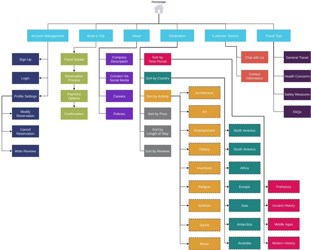
Plan IA and Content Before Visual Design
Think of information architecture as the floor plan. Get it wrong and no amount of fine typography will put it right. Figma’s research on website redesigns shows that many a failed project comes down to holding on to content users don’t need or cutting what was important for search. It happens when you do not have an IA and content strategy in place.
So decide on four things before you start mocking up:
- Top-level navigation: the five or seven options that reflect how people actually get here and what they want to do.
- Page-level content model: what page types you have, the modules they support and how they fit with search intent.
- Content disposition: for each current page, you keep it, rewrite it, merge it, delete it or redirect it (and document the 301).
- Primary user paths: the two or three journeys that put something in the pipeline. Optimise these first.
That is also how you solve the homepage problem. On X you will hear practitioners talk about the costliest mistake in the same terms: a homepage that tries to be all things to all people, with seven services and a vague claim to being different. A visitor makes up his mind in five seconds whether this is for him or not. One core offering, one audience, made painfully clear above the fold, will beat a cluttered page every time.
We saw it with Teton Gravity Research. They came to us wanting a redesign but before we put a number on it we had to figure out what to retire and how to move 10,000 articles from their legacy CMS without upsetting the publishing workflow or ceding any search equity. The visuals were the easy part; the IA and migration plan did the work.
Design a System, Not a Homepage
With the structure and strategy out of the way, the design side becomes much easier because you are not guessing. You are building a system of components, templates and rules that will hold up and not need reworking in 18 months.
Wireframes are a good place to begin. They remove the brand varnish so you are judging the bones of the page, not the shade of the button. A founder is more likely to be useful telling you he can not see who the page is for than asking if the blue can be darker. Wireframes save you from costly errors.
Then you put together the component library. Your buttons, cards and forms should be accessible by design and schema-aware where SEO is concerned. That is the discipline that allows a site to grow. When we put together the platform for SingularityHub, the editors could control the layout without any code because we built the system for them, not just for the launch screenshot.
A clever pattern is no substitute for a familiar one. You will see it in the threads on Reddit or Hacker News about major platform overhauls: common UI is a trust signal. Users know it. If you break with convention for no good reason they will pogo-stick and leave, regardless of the craft involved. Put some novelty on top of a solid semantic IA but do not displace it.
Make Technical Choices That Match the Business
Founders tend to feel exposed when it comes to choosing a platform since the decision feels permanent. Be it WordPress, headless CMS, custom or a hosted ecommerce stack. In the abstract none are better than the other. It comes down to who is running the site, how often the content turns over and what you have to integrate with.
| Profile | Usually fits |
|---|---|
| Content-heavy marketing site, frequent editor updates | WordPress with a custom block library |
| Standard online store, off-the-shelf operations | Hosted ecommerce or WooCommerce |
| Content plus product or app behavior | Headless or hybrid setup |
| Custom workflows, account logic, or unique pricing | Custom build |
| Large publisher with editorial workflows and legacy archive | WordPress with custom data model and migration plan |
You will run into the same two errors most do: going with the most flexible option when you have no need for it, or settling on the simplest one even though the business has long since outgrown it. Either way, you are looking at a rebuild in 18 months. And don’t think build cost is the whole story. You will pay for editing friction, plugin sprawl, integration and migration risk down the road, and they tend to run up a bigger tab than the initial engagement. If you want to see the trade-offs before you put pen to paper, our website redesign cost guide lays out the price bands by scope.
Launch Carefully, Then Treat Launch as Day One
Consider launch day your first live test, not the end of the line. The bulk of what can go wrong does in the first 72 hours, and for the most part it is avoidable if you have a defensible checklist:
- Put 301 redirects on any URL that has traffic or rankings. Don’t just let a crawler check them, test a few by hand.
- Make sure schema and metadata are intact on your key templates; run them through Google’s Rich Results Test.
- Do an end-to-end test of your forms. Check the CRM record, the confirmation and the email to the team.
- Have analytics and conversion tracking up and running with events firing on actual devices before the visitors come in.
- Measure Core Web Vitals on real templates, not some staging URL without any load.
- Document a rollback plan with DNS and database snapshots ready to go.
The website redesign checklist goes into more detail on launch governance and the kind of quiet failures that can undermine a redesign, from SEO loss to bloat and weak ownership.
Once you have launched, do not be in a hurry to make emotional calls in week one. Let the analytics get a clean baseline while users relearn how to navigate and search rankings settle. Give it a full 90 days and then compare to the metrics you established at the outset. A good redesign is one where you view the launch as the beginning of an optimization phase, not the close of a project.
Where Most Redesigns Quietly Go Wrong
If there is one thing to remember, it is the failure modes. Nearly every underwhelming redesign is guilty of something like this:
- Visual-only thinking. The brief was for a modern look rather than to solve a problem you can measure.
- A big-bang launch. One large release with no phasing or A/B tests and nothing to fall back on.
- Leaving SEO for after the fact. Getting around to URLs and schema in the last week.
- Bolt-on accessibility. Retrofitting contrast and focus states onto components that were never made for them.
- No one in charge. A homepage cobbled together by committee to please everyone and suffering from scope creep.
- Forcing templates on complex operations. Using an off-the-shelf theme for a multi-language or multi-platform business.
- Treating the finish line as the end. No monitoring, no iteration.
These aren’t technical blunders. They are matters of sequencing and governance. Better tools won’t fix them. You have to make the right calls in the right order before you even start designing.
Refact’s product and discovery process is there for precisely that early decision work if you are heading up a redesign. In this case, clarity before code is no empty slogan. It is what determines whether in a year’s time you have a site that justifies its budget or simply a pricier version of what you already have.

Parnia Sebti is a project and account manager at Refact, coordinating teams, clients, timelines, and delivery across the studio’s work. She helps keep projects organized from planning through execution, making sure communication stays clear and priorities stay aligned. Her role connects client needs with the internal team’s workflow, helping turn requirements, feedback, and moving parts into structured delivery. At Refact, Parnia also contributes to shaping the internal tools and processes the team uses to manage projects more effectively and keep work moving with clarity.
More from Parnia Sebti

