Real Estate Website Design That Actually Works
You will not find many real estate websites that do not lose the sale before a listing is even viewed.


The issue with real estate website design is not visual; it is one of data, speed and compliance, with some design layered on top. NAR’s online marketing guidance would have you believe that brokerage sites are among the few lead channels a firm has any control over, so the decisions made there should be taken seriously. This guide is intended for brokerages, teams and independent agents looking to do a rebuild, and it lays out the choices that count in the proper order.
Treat the Website as a Data Product, Not a Brochure
Designing a real estate site as though it were the marketing page for a consulting firm is the cardinal sin here. A consulting site might have ten pages of static copy. An estate site is a product built on a live data feed with thousands of pages in flux by the hour: listings going on or off market, open house dates, price reductions and sold histories. The design must account for that.
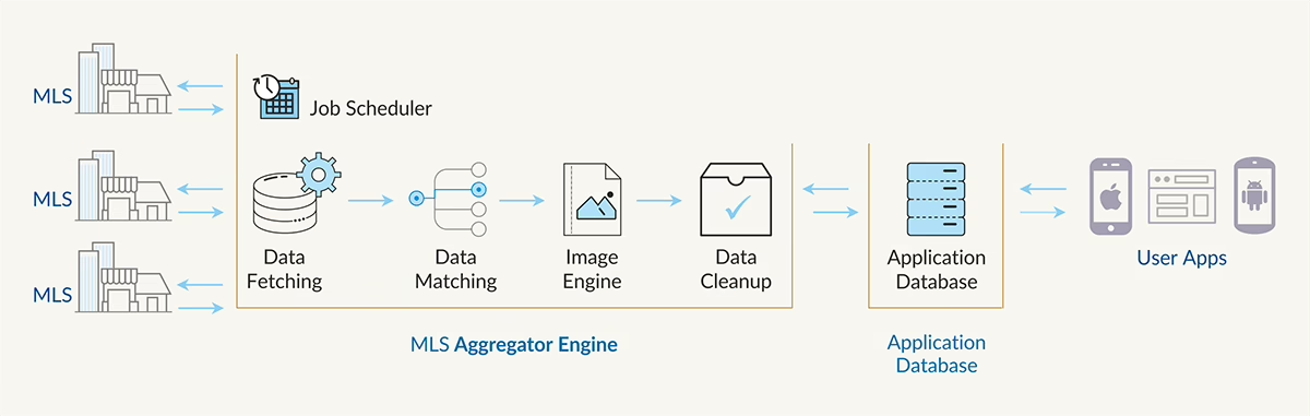
We see teams try to query the MLS live with every search and run into throttling and timeouts within the first month. A proper site will pull data via the RESO Web API or an old RETS feed, replicate it to a local index such as Elasticsearch or Postgres and serve the user from there. Trying to cut corners on this usually means a more expensive rebuild down the line.
And when it comes to displaying a listing, the components should map directly to the canonical fields the RESO Data Dictionary sets out, like PropertyType, ListPrice or StandardStatus. Make up some custom fields in Figma without verifying the MLS has them and you will end up with a handsome listing card that half your inventory cannot populate.
IDX and VOW rules will constrain your design
There are rules to follow with Internet Data Exchange (IDX) and Virtual Office Website (VOW). They tell you where attribution belongs and how long a sold listing may be shown. Do not put the MLS logo and disclaimers in a footer where they can be missed; they belong next to the data. Should you wish to put deeper historical data on display, an authenticated VOW is required from the start. To add authentication to a public site after the fact is to break your SEO and bewilder your users.
Make your status labels and disclaimers modular. When the 2024 NAR settlement came around and forced a change in how commission information was presented, the brokerages that adapted swiftly were those with reusable components rather than hardcoding in their templates. Legal copy is a moving target. Design accordingly.
Plan the Site Before Anyone Opens Figma
A lot of poor projects are doomed before a pixel is put to screen because the team has no idea what the site is for and tries to make it do everything. At Refact we prefer to call the discovery phase “clarity before code” given what we have seen. Take our work on CRE Daily’s platform for a commercial brand with 65,000 newsletter subscribers. We spent the first month determining what the site had to do for the editorial team, sponsors and readers before we gave any thought to the visuals.
Before the design begins, these things need to be settled:
- The primary outcome. Is it for seller leads, recruiting, or investor inquiries? Choose one. You cannot prioritise if everything is equal.
- The audience. Luxury sellers and first-time buyers require different proof and trust signals.
- The trust gap. If you are not a household name, put out what gives the site credibility: verified sales, reviews, agent bios with actual photos.
- The operating reality. Who is responsible for the site post-launch? Who writes the neighborhood pages? Without an owner, the site will decay in six months.
If your developer is left to infer your business model from the wireframes, you have not done your strategy.
Build the Search Experience Like a Landing Page
The money is in the search and listing detail pages. All other parts of the site are there to funnel users to those two or convert them once they arrive. They should be treated as revenue-critical surfaces in the same way an ecommerce team handles its product pages.
Yet real estate search pages are prone to failing Google’s Core Web Vitals. LCP is compromised by a heavy map canvas or hero image; CLS by an ad or consent banner that appears after paint; INP by filter chips running too much JavaScript on the main thread. A healthy page should have Largest Contentful Paint under 2.5 seconds, Cumulative Layout Shift below 0.1 and Interaction to Next Paint in the 200 millisecond range. Studies show you can pick up 2 to 5 percent in conversion by trimming 300 to 500 milliseconds off TTFB or LCP. That is a better use of time than another feature.
- Server-render your search and detail pages. There is no reason to put out a client-only React shell to go fetch listings after mount.
ZZBLOCK5ZZ – Put the squeeze on images with WebP or AVIF and make use of srcset. There is no reason a phone should be tasked with downloading a desktop version of a kitchen.
– Every image and embed needs its aspect ratio set in CSS. You will find that this single step resolves the bulk of CLS issues.
– Let galleries below the fold lazy-load. The visitor is not going to see photo 14 in the first second anyway.
– Have a look at your third-party scripts. INP is most often hamstrung by things like chat widgets, tracking pixels and map SDKs.
– Make the map view an advanced option rather than the default. For lead actions on mobile, a list-first approach will almost always beat map-first. Save the map for the power user.
Filters should be practical, not exhaustive
You will see portal-type sites put out twenty filters or more simply because the MLS allows it. It is easy for a user to get turned around. If you read the practitioner threads on how to hold your own against Zillow as an independent, the answer is invariably the same: zero in on the six that count (price, beds, baths, type, location and a differentiator such as waterfront) and relegate the rest to advanced options. Allow for some relaxation when results are empty; a search that comes up with nothing and offers no way to broaden it is one that ends right there.
Pick a Stack That Matches How the Business Runs
Tech vendors love to push real estate teams one way or another. One will tout a template builder, another a bespoke React app, and a third will tell you WordPress is the only thing worth considering. In truth, none of them have the whole story.
| Option | Good fit when | Watch out for |
|---|---|---|
| Template site | Solo agent needs presence quickly, no unusual workflows | IDX styling limits, weak SEO control, hard to differentiate |
| WordPress | Brokerage or team needs content control, SEO flexibility, and IDX plugins with room to customize | Plugin sprawl, hosting quality, ongoing maintenance discipline |
| Custom build | Portal, unusual search logic, investor dashboards, multi-MLS aggregation, agent portals | Higher cost, longer build, needs an engineering team behind it |
WordPress development is the sensible middle ground for the majority of brokerages. You get your content, SEO and IDX integration without having to put together a fully custom stack, and the plugin ecosystem is deeper than any CMS can claim. Should you be pitting it against page builders, we have covered the architectural trade-offs between Webflow and WordPress. A shortlist of CMS options is also something to review before making a commitment.
That said, custom work has its place when the site is more software than marketing property. Off-the-shelf tools become a limitation with multi-MLS aggregation or agent recruiting flows with scoring logic. We would recommend our guide on adding an investor portal if that is part of the plan.
Do not let launch speed dictate your stack. Factor in who is doing the editing and maintenance and what the annual tab looks like once you add in hosting, IDX and plugin fees. Most brokerages are off by half on those ongoing costs. Our breakdown of website maintenance goes into the numbers most quotes omit.
Design for Trust, Not Just Aesthetics
The design counsel you find in most real estate writing is pretty thin: big photos, clean type, whitespace. That is all well and good but it does not close deals. Trust does, and that comes from specific choices.
A cold prospect will come to your site on a phone in between other things. They scan, they do not read. In five seconds they want to know you are a real brokerage in their area and that getting in touch will be productive, not a week of drip emails.
Trust choices that move the needle
- Use actual photos of your agents. Stock makes a brand feel hollow.
- Be specific about service areas. “Serving the Eastside” has more weight than “the greater metro.”
- Give reviews some context. A quote from a neighborhood transaction is better than a generic five-star rating.
- Set expectations. “We typically respond in an hour on weekdays” inspires confidence.
- Employ soft CTAs where intent is high. “Save this search” or “Schedule a tour” will convert where a “Contact us” button and a registration wall will not.
There is a question of how aggressive to be with lead capture. Zillow can gate everything and get away with it given their volume. A local operation cannot. Put up a forced registration and you may see more leads, but the quality will suffer and the sales team will be wasting time on dead ends. Reserve gating for a market report or full valuation and keep the rest open.
Mobile disclosure done right
You have a lot of data to present: price, taxes, HOA, square footage, year built, schools, disclosures and so on. Do not try to cram it all above the fold on a mobile device. Layer it:
- The decision makers. Hero, price, address, beds and baths.
- To build confidence. Your name, the brokerage, a save button.
- For those who want depth. Floor plans, tax history and forms should be behind a tap, not stacked on the screen.
If the site feels heavy and you are unsure where trust is breaking down, a [UX audit](https://refact.co/insights/digital-product/ux- audit) will likely point to weak hierarchy on your listing pages or buttons asking for too much too soon.
Accessibility and Compliance Are Design Constraints, Not Add-Ons
Compliance is taken more seriously in real estate than in most verticals. Under HUD, housing marketing is a protected activity, so a carousel with no alt text or a form with poor labels is not merely a usability matter. To avoid trouble with fair housing and WCAG, make accessibility part of the design system from the start rather than a post-launch fix:
There is a place for styled divs, but we prefer our HTML to be semantic with proper headings. Filters, modals and forms should all be navigable by keyboard. Every image in a listing gets alt text that includes the room description and property address. Labels over hero photos have enough contrast to be read without strain. We put text summaries on maps and virtual tours as well. And when it comes to tracking scripts on financial tools such as valuations or mortgage calculators, consent has to be granular and revocable.
Then there is the matter of fair housing risk, which applies to AI as much as anything else. If a recommendation engine or lead scoring system starts to show a bias for or against certain listings because of neighborhood demographics, that is algorithmic steering. The same goes for chatbot triage. Any AI in the lead flow must have routing rules you can explain; otherwise an agent will not trust it and compliance will have questions. Opaque scoring is something we see get rolled back every quarter.
Content and Local SEO Do the Long Work
You have your listings to drive the search traffic and your content to build the trust needed to make those listings convert. A good neighborhood page is where the two come together. When executed properly, you will find unique local data – median price, walk scores, school ratings – alongside a real editorial perspective on the area and links to what is on the market. Do it poorly and you have a thin template with 200 words of generic copy and the neighborhood name pasted in. Google and buyers are quick to spot the difference.
We keep it to one keyword cluster per URL and use schema for local business and listings. There is long-tail Q&A for voice search and a guide to boosting visibility for the tactical side of things. But the discipline is straightforward: put out one solid page for a given search intent rather than five weak ones at each other’s throats.
Take the Estate Media redesign. We had a tight schedule, so the SEO structure was in place before any visuals were considered. Brokerages that do not protect their URLs and content hierarchy during a relaunch can expect to lose 40 to 90 percent of organic traffic in a night.
Measure Lead Quality, Not Just Traffic
An increase in traffic means nothing if closed deals are flat. Before any redesign work commences, we want to know the baselines: cost per qualified lead, how fast an agent responds to an inquiry, form-to-conversation rates and the like. Then we track them post-launch. Should lead volume go up while qualified conversations drop, you have a problem in the funnel that no amount of pretty screenshots will remedy.
Most sites fail quietly at the handoff. An inquiry goes to a shared inbox, an agent checks it on his own time and the hot lead has gone cold in an hour. A stack that is worth its salt will use webhooks or a queue to put the lead in front of the right agent, tie into the CRM and check calendar availability for a tour in real time. You will not see that backend work in a portfolio piece, but it is what makes the site a business asset.
What to Do Next
Designing a real estate site in 2026 is really a systems problem. The site is a node in a pipeline that goes from MLS ingestion to a local search index, to a mobile experience and eventually into an agent’s calendar. Some treat the site as a brochure; others see it as an integrated, compliant data product with the visual design layered on top.
So if a rebuild is in the works, the first thing to do is not pick a color palette or a template. Write down who the audience is, what the conversion action is, where the current site lacks trust and which features are tied to revenue. Make that part of a strategy discussion, not a design brief.
Our product design process and the work we do with real estate brands are founded on that sort of clarity. It is the kind of conversation we would have with you to give a second opinion on what the site ought to be doing before a design tool is even opened.
Building a product and unsure what to scope first? Let’s talk. Free 30-minute call, no pitch.

Saeedreza Abbaspour is the CEO of Refact, where he works across product, engineering, and sales. He sets the studio’s direction while staying closely involved in the work itself, from shaping product strategy and UX architecture to helping define the technical systems behind Refact’s projects. His role connects business thinking with hands-on product execution, giving him a practical view of how software should be planned, built, launched, and improved. At Refact, Saeedreza focuses on building a studio that can move quickly, solve real client problems, and turn ideas into reliable digital products.
More from Saeedreza Abbaspour
