

You would be hard pressed to find a consulting site with better polish that does not still come up short on the very thing it is supposed to do. The design is of the moment, the photography has been paid for and the copy has an air of intelligence about it, yet the inbox is quiet. They have the traffic but not the meetings. Rarely is this a matter of taste. More often than not, the site was put together as a brand exercise rather than a lead-generation product with something to show for it in the way of measurable outcomes.
There is a familiar pattern in the post-mortems from firms that have done a recent redesign, or in the threads on X and Reddit. The new site goes live to general approval, and then inquiries flatline or worse. If one were to look at why, the causes are the same: the agency did not put in place a measurement plan, the homepage leaves you guessing as to who the firm actually helps, and no one took the time to define what a lead is.
Consider the numbers from DesignRush’s web design statistics: 88% of people will not come back after a poor experience and three quarters of consumers will form an opinion on your credibility from the design alone. The exact figures are less important than the direction they point. A buyer is making a quick assessment of whether your firm can think clearly. A headline that is too vague, a hero section that is slow to load, or a case study couched in agency-speak all say the same thing: this firm is probably not going to be sharp when it comes to my problems.
For the consultant or firm owner with a rebuild in the works, this guide is meant to cover the ground that matters. It is about clear positioning above the fold, the governance decisions that keep a site from quietly aging out, and the proof that can stand up to a skeptical eye.
Why Polished Consulting Sites Still Lose Leads
Before any talk of templates or visual direction, a consulting site must satisfy three technical floors. You can dress them up however you like, but if you fall below any of them, no amount of design finesse will make up for the conversion you have lost.
The Three Floors Every Consulting Site Has to Clear
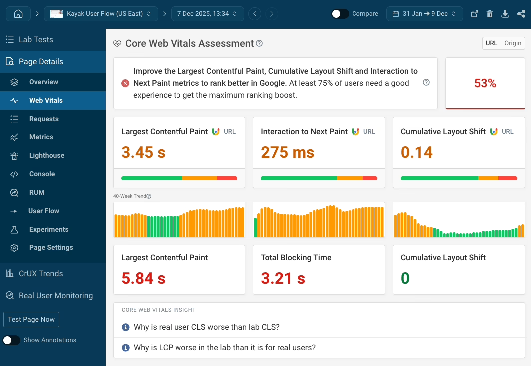
Google’s Core Web Vitals are where the rubber meets the road. We are talking Largest Contentful Paint under 2.5 seconds, Interaction to Next Paint in under 200 milliseconds and a Cumulative Layout Shift of 0.1 or less. These are not vanity metrics; they are derived from Chrome field data and dictate how your site is ranked and received.
The hero is the usual culprit for breaking this performance floor. Put in a large background video, an unoptimised image and a font stack that loads late, add in a couple of third-party scripts for chat and analytics, and you have pushed LCP past three seconds with some layout shift to boot on mobile. The solution is to establish a performance budget for the top pages before the design work begins. Video and heavy imagery are fine so long as they fit within it.
The performance floor
Two decades of research from Nielsen Norman Group tells us that visitors will skim the top-left of a page and leave if their questions are not answered quickly. Your first screen needs to be plain about four things: who you help, the outcome you provide, why the visitor should care and what the next step is.
Baymard Institute has found the same with calls to action. Specificity wins over urgency. “Schedule a 30-minute strategy call” is more effective than a generic “Book now” because it is clear what the reader is signing up for. For those who are hesitant, a lower-commitment option like “View case studies” keeps them from walking away.
The clarity floor
Then there is the matter of accessibility. The 2026 WebAIM Million study shows errors on the top million home pages are on the rise, correlated with page complexity and an overuse of ARIA. It is counterintuitive, but true: more custom components and widgets tend to mean more failures. Stick to semantic HTML and standard form controls.
To a consulting buyer, an accessible site is a sign of thoughtful engineering. They may not be able to articulate why a keyboard trap or an invisible focus state is off-putting, but they notice it.
The accessibility floor
In the end, the homepage is a form of triage. In the first 100 or 200 words it should let the right visitor in and the wrong one out without costing your sales team any time. A solid structure has a headline that names the audience and the result, a subhead for the service, a primary action and some proof. Not the kind of trust signal that says “trusted by industry leaders,” but a client logo or a testimonial with a name and title to it. The Balance suggests a minimum of three case studies with hard numbers, though the stronger firms have six to twelve.
ZZBLOCK6ZZ There is a certain sanity in that range. You will not put a consulting site over the trust line with an anonymized tale of some “Fortune 500 client.” But put three named engagements on the page, each with the situation and approach laid out alongside a tangible result, and you have done it.
For the solo consultant, a long page is often the way to go. Put your orientation, trust signals, services and CTA in good order. It is not a shortcut so much as the proper structure when the content does not warrant more than one page. A short site with a tight sequence will generally do better than a five-pager that goes over the same ground twice.
Content Architecture: Pages That Earn Their Place
Your homepage has to do its part, then the secondary pages are there for the questions a particular buyer will have. The standard lineup – about, services, case studies, a contact option a click away from anywhere – is typically sufficient. Only put in industry or practice-area pages if the context demands it. If you work with both CFOs and operations leaders who require different proof and speak in different terms, they should have their own space.
Keep navigation predictable. Let the labels tell the visitor where they are going; cleverness has no place here. A buyer left to wonder what is behind “Perspectives” or “Approach” will simply move on. When working with an agency on scope, the website design RFP guide is a handy reference to define what is needed rather than what makes for a flashy proposal.
Case studies deserve the extra investment. In B2B circles, a case study that walks through what was broken and how you fixed it will beat a Figma portfolio any day. Buyers want to see the kind of mess your firm is at ease with.
Platform Choice: Match It to Who Maintains the Site
Founders tend to ask which platform is superior. One ought to ask instead which one the team can run for the next few years. For a content-heavy consulting site where the marketing lead wants to make updates without putting in a ticket, WordPress is the sensible default. It is extensible and easy to hand off. Refact’s WordPress development work is of this sort, giving the client a clean editor so the site does not harden after launch.
You can justify a headless or custom stack, but not on the basis of taste. Unless you have very strict performance needs or content that must be pushed to multiple surfaces, the complexity is a tax you pay every time you need to alter a page. Our piece on B2B website redesigns goes into the tradeoff that most firms encounter.
SEO and Conversion: Where the Traffic Actually Comes From
Then there is the matter of traffic. Without intent it is just expensive noise. Consulting SEO is a narrow field. A blog of thought-leadership pieces will not build pipeline like a few well-scoped service and case study pages will. Target the queries your prospects are already typing before they bring you on board.
AI has altered the mechanics of staying competitive. If you have pages that are half-ranking for adjacent terms, Month17 has a walkthrough on using Claude to expand those rankings that is worth a read. The idea is to use AI to give more coverage to what is already getting attention, not to create thin new pages.
On conversion, cut the friction you can measure. The primary CTA should be above the fold. Do not put a scheduler behind a form. And the contact form should only ask for what sales actually needs. If a service page is drawing eyes but not conversions, the problem is likely in the positioning. Analytics will show you the drop-off points.
Governance: The Boring Part That Decides the Outcome
Keyhole Software’s 2026 research on outsourcing failure puts the top cause at 55%: a lack of benefit tracking. Add in inadequate change management and strategic misalignment and you have the profile of a failed project. A consulting website redesign is no different. Without someone to name the metrics and plan the iteration, you are left with a good photo of the launch and not much more.
Governance is what separates the two. Establish your baseline in page speed and booked calls before you start on the design. Have one person on your side with the authority to decide, not a committee. Make sure the scope is in writing with revision limits and a Figma approval before development. And take ownership of the domain and hosting accounts from the outset.
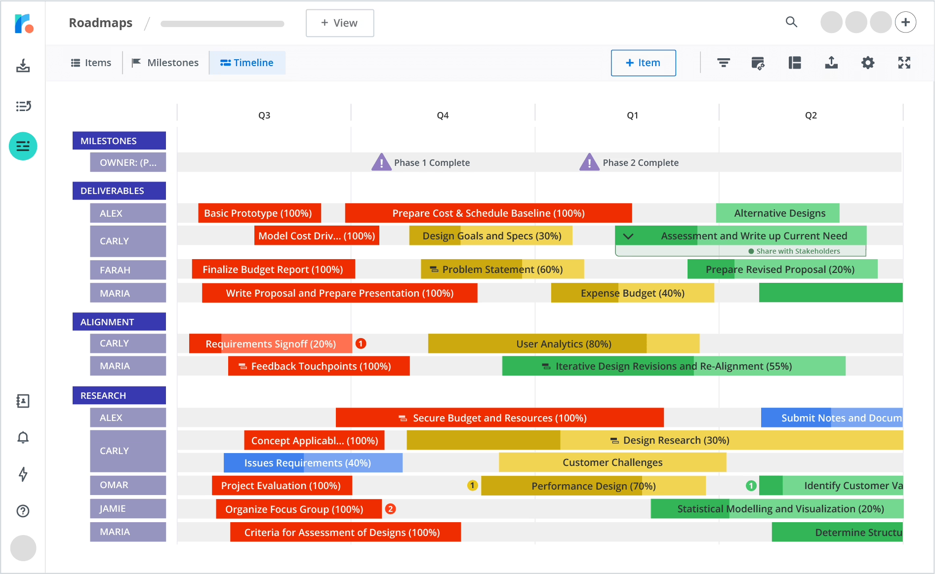
Most sites lose their edge once they are live. View the site as a product with a small backlog and put a budget toward website maintenance and support to fund that cycle. Zinavo’s published case is instructive: three months of post-launch work saw session duration climb 40% and bounces fall by 25%. The win was not in the initial launch, but in the iteration.
How This Plays Out in Practice
There is a clear pattern in the work we do for publishers and media, one that has more in common with consulting than it might seem. The two are alike in being trust-driven and content-heavy, with success hinging on a few high-value conversions. Take what we put in place for CRE Daily when we overhauled their platform. On the surface you see a better reading experience, but the substance of the job was to align the navigation and content architecture with the way their subscribers make the choice to engage. We had to make sure the homepage could tell a commercial real estate pro in a matter of seconds who the newsletter is for and why the coverage is worth his time.
A consulting firm would be well served by the same discipline. For those looking to budget a rebuild, we have set out the price bands and the lifecycle costs you do not see on a proposal cover in our website design cost piece, so any quote can be measured against what is truly being put on the table.
Where to Start If You Are Planning a Rebuild
Put pen to paper before an agency is given the brief or Figma is opened. Jot down four items: the quarterly number of leads your firm needs and what they are worth; what the existing site is turning in by way of comparison; the pages that have the most sway in a buying decision; and the sort of questions prospects raise on discovery calls that ought to be handled by the site.
You will find that document has more value than a moodboard. It puts a different spin on how an agency proposes and how the outcome is judged. Do the discovery right and the design will be simpler to measure and quicker to put in place. Refact’s approach to consulting firm website development is predicated on this kind of upfront clarity, viewing the site as revenue infrastructure rather than an exercise in brand refreshment, long before anything is committed to code.
The winning websites of 2026 will not be distinguished by having the latest visual trends. They will be the ones that quietly meet technical requirements and address the buyer’s concerns within the first couple of scrolls, then get better with each passing month. It is a matter of discipline, and one that can be solved.

Saeedreza Abbaspour is the CEO of Refact, where he works across product, engineering, and sales. He sets the studio’s direction while staying closely involved in the work itself, from shaping product strategy and UX architecture to helping define the technical systems behind Refact’s projects. His role connects business thinking with hands-on product execution, giving him a practical view of how software should be planned, built, launched, and improved. At Refact, Saeedreza focuses on building a studio that can move quickly, solve real client problems, and turn ideas into reliable digital products.
More from Saeedreza Abbaspour

