7 Design System Examples Worth Studying
Most teams copy a component library before deciding which product decisions it should standardize.


The useful lesson from a strong design system is not visual. It is how the team behind it manages change, contribution, versioning, accessibility, and adoption over years of real product work. A design system is a set of standards for managing design at scale, as the Interaction Design Foundation defines it, but the standards are what matter, not the swatches. This piece walks through seven design system examples worth studying, what they actually solve, and what a smaller SaaS, publishing, ecommerce, or dashboard team can borrow without dragging the whole ecosystem into a build. If you are working out how these decisions fit into a broader digital product design process, the framing matters more than the components.
One number to hold in mind while reading. In zeroheight’s 2023 Design Systems Report, only about 7% of organizations reported full adoption across all teams, and driving adoption ranked as the number one challenge for the fifth year running. Most systems are technically fine. They are organizationally ignored.
1. Material Design 3 by Google
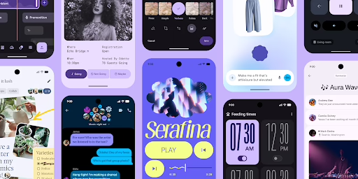
Material 3 is the most complete example of a design system that tries to cover an entire product surface. Google publishes theming, components, motion, layout, and accessibility guidance together, with Figma kits and code for Android, Jetpack Compose, Flutter, and web. For a team prototyping a new SaaS or mobile product, that continuity is real: the same token can travel from a design file into a Compose component without three intermediate translations.
Where it earns its weight
Material 3 works best when your product must feel coherent across screens without inventing a visual language from scratch. Its dynamic color system, expressive typography, and motion tokens give a team a defensible baseline on day one. Two catches. First, Material carries a strong point of view about how interfaces should feel, so pulling it toward a distinct brand takes real work. Second, mixing older Material 2 patterns with Material 3 inside the same product creates the kind of drift that survey data keeps flagging, where designer satisfaction runs well ahead of developer satisfaction and specs diverge from code.
Borrow the theming model, the component state coverage, and the motion vocabulary. Do not copy the sprawl. A small team almost always ships fewer surfaces than Material assumes.
2. Carbon Design System by IBM
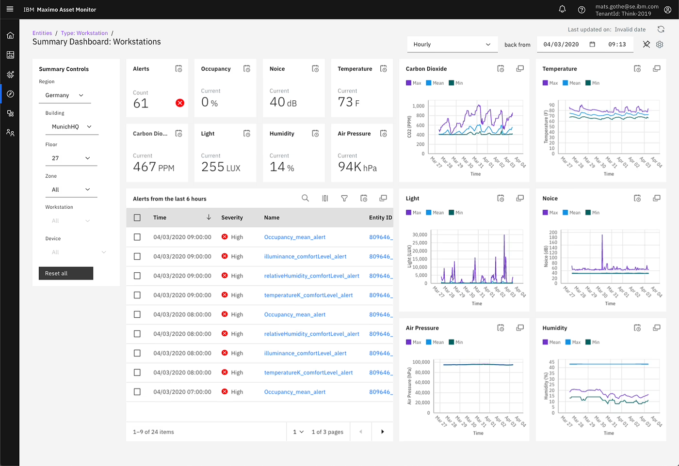
Carbon is what a design system looks like when the product is dense, permissioned, and administrative. IBM ships Carbon across React, Angular, Vue, Svelte, and Web Components, which tells you the audience is engineering teams who need the same primitives in five different stacks. If your product involves tables that scroll for a hundred rows, filter panels with dependent selections, or configuration screens with audit history, Carbon has already argued with those problems.
Why it is a strong reference for dashboards
Carbon’s value is in its restraint. It gives teams a stable spacing scale, accessibility guidance that is treated as a release criterion rather than a documentation topic, and enough component coverage that engineers stop rebuilding the same date picker every quarter. That matters because the 2023 UX Tools Design Tools Survey found 46.3% of teams saw significant inconsistencies between design specs and implemented components. A system with clear component behavior in code is one of the few practical defenses.
The cost is a learning curve. Carbon assumes a team large enough to maintain conventions. A four-person startup should read it, borrow its layout primitives and accessibility rules, and skip the deeper ceremony. The lesson is separation of concerns: visual taste is one problem, workflow discipline is another, and Carbon is a masterclass in the second.
3. Fluent 2 by Microsoft
Fluent 2 exists because Microsoft needs Teams, Outlook, and Windows to feel like one product across web, desktop, iOS, Android, and Windows itself. That is the scenario Fluent addresses well. Tokens, Figma kits, and component libraries are published for each platform, with a shared design language holding them together.
A useful model for mixed-platform products
The strength here is language consistency, not visual polish. A form, a modal, or a command surface behaves the same way whether a user is on a browser or a desktop client. If your product ships on more than one surface, you need this kind of contract or you end up with two teams reinventing the same interaction under different names.
The trade-off is parity. React and web tend to be the most mature areas of Fluent, with other platforms catching up on different schedules. Teams that adopt Fluent for cross-platform coverage should treat platform parity as an ongoing engineering commitment, not a shipped feature. Fluent’s biggest borrowable idea is behavioral, not visual: define one canonical version of each recurring interaction, then reuse it across platforms.
4. Polaris by Shopify
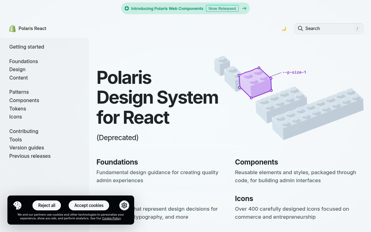
Polaris is the system to study when your product lives inside Shopify. The current documentation focuses on Polaris Web Components for Admin, Checkout, and POS surfaces. For a Shopify app or extension, that first-party fit reduces friction more than any generic aesthetic ever will. Merchants already know how these components behave.
Built for Shopify-native products
Polaris earns attention for one reason most systems ignore: it documents versioning and pinning as first-class concerns. That matters because Shopify apps are maintained software, not launch-day websites. The move from older React patterns to Web Components is well underway, and Polaris uses that migration to model how a mature system handles breaking changes: explicit deprecation, migration guidance, and a clear public contract.
The catch is fit. Outside the Shopify ecosystem, Polaris loses much of its value, because the reason to adopt it is platform context. A custom storefront can borrow Polaris conventions for spacing, forms, and app chrome, but it should not pretend to be Shopify unless it lives there. When we built the NudFud ecommerce platform on WooCommerce, we made exactly this call: the product structure and content model needed to speak the brand’s language, not the platform’s, so we borrowed conventions rather than a whole system.
5. Salesforce Lightning Design System 2
SLDS 2 is worth studying if your product sits inside or beside Salesforce. It covers principles, icons, accessibility, and how to apply the system in Visualforce and Lightning Web Components. For CRM workflows and partner apps, matching the host environment eliminates a category of friction that no amount of good design can otherwise fix.
Why partner products should pay attention
The main value is familiarity. When a partner tool looks native inside Salesforce, users stop relearning the interface and start getting work done. That matters for dashboards, workflow apps, and configuration-heavy tools where every extra click is noticed and remembered.
SLDS is strongest when your product lives alongside Salesforce, not when you are building a consumer product from scratch. Documentation moves, so treat the live guidance as the source of truth and old screenshots as archaeology. The practical question to ask before adopting SLDS is simple. Will users spend most of their working day inside Salesforce? If yes, adopt it. If no, borrow its semantic and accessibility discipline as reference points and move on.
6. Atlassian Design System
Atlassian Design System is the strongest example here for SaaS teams whose product is mostly forms, tables, navigation, and collaboration flows. Atlaskit packages on npm give React teams working code, not just Figma guidance, and the tokens are treated as an interchange contract rather than a naming convention. That framing matches where the emerging Design Tokens Format Module specification is heading: tokens as a typed protocol, with aliases, deprecation, and theming built in.
Practical for productivity software
ADS is strongest in the dull, load-bearing parts of a product. Navigation patterns, responsive behavior, content guidance, and layout primitives are documented as decisions with consequences, not preferences. If your team is building issue tracking, knowledge tools, project management software, or a publishing dashboard, the system gives you a defensible baseline you did not have to invent.
Two cautions. Atlaskit is React-first, so teams outside React will do extra work. Packages move quickly, so version tracking matters more than in a static kit. Treat ADS as a source of patterns and primitives, not a package to install and forget. When a team is turning that kind of product thinking into a build plan, focused UI and UX design services generally produce a better return than a growing backlog of one-off components.
7. U.S. Web Design System
USWDS is the sharpest example here of accessibility-first, content-clear interface work. Built for public-facing government sites, it focuses on semantic components, utility classes, theme configuration, and progressive enhancement. That makes it a strong benchmark for any team that cares about clarity under real constraints, including bandwidth, assistive technology, and users who cannot afford a failed task.
Best reference for accessible public interfaces
The main strength is discipline. USWDS keeps the interface grounded in semantics and readable content, which is what users need when completing a task rather than admiring a layout. If accessibility is a hard requirement, or your audience is broad, this is one of the best public systems to study. If you want a technical companion on how accessibility rules translate into UI decisions, our piece on contrast ratios explained covers the practical side.
The trade-off is visual character. USWDS leans civic, so consumer brands need more customization than they expect. Its component set focuses on common government patterns, so it will not cover every app scenario out of the box.
The deeper lesson lives in one small component: the tag. USWDS warns that tags are often confused with buttons, so teams should not mix interactive and static tags, and should disable hover, focus, and active styles when tags are not interactive, per the USWDS tag component guidance. GOV.UK makes a similar point, saying its Tag component is for status, not links or buttons, and that teams should use the smallest number of statuses needed and expand only if user research shows a need, in the GOV.UK tag guidance. Michelin goes further, keeping tags short at two words maximum and placing them in rows under a header or at the end of content, as described in the Michelin tag component. Three teams, three products, one recurring failure mode. That is what a good design system does. It writes down decisions so the same mistake does not have to be relitigated in every squad.
How These Seven Compare
| Design system | Best-fit product | Implementation approach | Main caution |
|---|---|---|---|
| Material 3 (Google) | Cross-platform SaaS, mobile MVPs, Android | Figma kits plus code for Android, Compose, Flutter, web | Opinionated aesthetic; Material 2/3 mixing creates drift |
| Carbon (IBM) | Data-heavy dashboards, enterprise B2B | Component libraries across React, Angular, Vue, Svelte, Web Components | Depth assumes a team large enough to maintain conventions |
| Fluent 2 (Microsoft) | Products shipping on multiple platforms | Shared tokens with per-platform component libraries | Parity varies by platform; theming is real work |
| Polaris (Shopify) | Shopify apps, extensions, and merchant tools | Web Components with React adapters and pinning guidance | Value depends on living inside Shopify |
| SLDS 2 (Salesforce) | Salesforce partners and CRM-adjacent apps | CSS framework, tokens, Lightning Web Components guidance | Loses value outside the Salesforce ecosystem |
| Atlassian Design System | SaaS with heavy forms, tables, navigation | Atlaskit React packages, tokens, working code | React-first; fast-moving packages need version discipline |
| USWDS | Public services, accessibility-first products | CSS framework, utility classes, theme configuration | Civic visual character; limited coverage for consumer apps |
What Actually Determines Whether Your System Works
The seven examples above are useful precisely because they show what changes once a system leaves the launch stage. The recurring failure mode is not weak components. It is weak governance, weak measurement, and treating the launch as the finish line. Roughly 40% of design systems do not remain active beyond 18 months, according to one 2023 report, and among stalled systems, 73% cited lack of a company mandate while 55% cited weak governance. Component quality was almost never the reason.
Adoption is a range, not a switch
Teams often report they have adopted a system when they have imported the library but overridden most of the styling, or used the tokens without the components, or used the components but forked them internally. All of those states are common. None of them are the same as adoption. Better questions to ask about your own system: what percentage of shipped UI uses supported components, how many consumers are on the current version, how often are components forked, and how quickly does a breaking change actually migrate? Those numbers tell you whether the system is real infrastructure or a decorative library.
Governance fails in two symmetric ways
Centralized governance creates bottlenecks. Product teams file requests, wait, build workarounds, and detach. Absent governance creates fragmentation. Local exceptions accumulate, patterns diverge, and after a year the library is a museum of small differences. The teams that avoid both extremes tend to use federated ownership: a central team owns the platform and the standards, product teams contribute components and patterns, and decision paths are differentiated so a routine change moves faster than a change to a public API or accessibility rule. That structure is boring to describe and hard to fake.
Design-to-code drift is a measurable tax
The 2023 UX Tools Design Tools Survey put average time from design-system spec to implemented component at 3.7 weeks, with 46.3% of teams reporting significant inconsistencies. That gap is where drift lives, and it does not close on its own. Tokens stored in a machine-readable format, executable documentation, and CI checks that catch overrides before they ship are what shrink it. A design-system button set to h-10 for WCAG compliance is worth nothing if a call-site className silently overrides it to h-4, which is exactly what drift-detection tools now scan for.
Documentation has to be executable
The systems that stay useful past 18 months treat documentation as code, not marketing. Live examples, tested snippets, explicit empty and error and overflow states, and version-aware migration guidance are the difference between reference material teams trust and a static site nobody opens after week two. Typography choices deserve the same discipline, and a practical audit like this one on design system typography principles can surface issues that a component gallery hides.
How To Borrow From These Systems Without Copying Them
Start with the surfaces that repeat in your product. Inventory the UI you already build, name the decisions that tokens should control, and choose a reference system whose primary constraints match yours. Material 3 for broad platform coverage. Carbon for dense data and workflow depth. Fluent 2 for cross-platform parity. Polaris for Shopify-native work. SLDS for Salesforce ecosystems. Atlassian for SaaS interaction. USWDS for accessibility-first public patterns.
Then prototype a small set of high-use components, test them under real content and real states, and write down accessibility and content rules before adding visual polish. Keep the number of variants deliberately small. Add variants only when you can point to a recurring use case. Audit and remove rather than layering documentation on top. If your product story itself is still shifting, that is a signal to spend time on a proper SaaS product foundation before enlarging the component set.
Brand consistency across channels is a related but separate problem, and treating them as one usually confuses both. If your marketing team is drowning in one-off adaptations, tooling like brand consistency software solves an operational problem your design system was never scoped to handle.
Where Refact Fits
Most of the teams we work with do not need a system as broad as Carbon or as opinionated as Material. They need a defensible baseline for the ten to twenty components that carry their product, documented in a way engineers can trust and marketers can extend. That is the middle ground where our product design work lives: reusable components, patterns, and rules for the interactions your product actually depends on, with governance and versioning treated as first-class deliverables rather than afterthoughts.
If you are deciding which parts of a design system you actually need, and which parts you can leave to the reference system on your shelf, that is exactly the kind of early decision our discovery process is built to settle.
Building a product and unsure what to scope first? Let’s talk. Free 30-minute call, no pitch.

Hossein Karami is a senior frontend web developer at Refact, building the interfaces and user-facing experiences of the studio’s products. His work spans React-based applications, product UI, performance-focused implementation, and the integrations that connect frontend experiences with the systems behind them. Hossein works across the full stack when needed, bringing together design, usability, and engineering to create products that feel clean, responsive, and reliable. At Refact, he helps turn product ideas and interface concepts into polished digital experiences that users can actually work with.
More from Hossein Karami

