UI UX Design Services That Ship
There is a design proposal in your inbox.


That uncertainty is the crux of the matter when it comes to purchasing UI UX services in 2026. You hear the same refrain from buyers on X: the portfolios are fine, but the work lacks any real problem-solving or depth of UX. Founders aren’t being overcharged for the design itself, they are paying a premium for a kind of polish that does not alter user behavior.
This guide is meant for anyone poised to put a signature on one of these proposals. We set out what UI and UX should be delivering, what an honest price looks like and where engagements tend to come undone.
What UI and UX Actually Buy You
To make sense of a proposal, it helps to separate the two in your mind. UI is what you see: the type, the cards, the states, how the product presents itself on mobile and desktop. UX is the decision-making path a user takes to get something done. A signup flow with poor buttons may be clean but it erodes trust; a dashboard can be beautiful yet still drive users away if it is not navigable. Competent services treat them as a single discipline.
The test is what precedes the opening of Figma. If there is no discovery or validation, you are buying visual work with a UX label slapped on it. For more on the discipline behind this, have a look at our digital product design guide.
Why the split still matters
UI questions are of the variety: how is the empty state to be read, what is the primary button like? UX questions ask what the error copy does when Stripe turns down a card, or which flow a new user is most likely to abandon. If a partner can only address the former, they are styling. One who can do both in the context of your product is doing UI UX design. You will see the difference in the deliverables and again after launch when users do the unexpected.
The Deliverables a Serious Engagement Produces
A proper engagement has a sequence to it. You don’t save time by skipping a stage, you just defer the decision to a more costly one. Discovery and interviews with stakeholders must come first so the team knows what the business needs and where the current product is failing. In some circles this is what distinguishes outcomes from mere decoration. There was a B2B case put forward on X where research on the factory floor and workflow mapping led to a four or five times lift in engagement. Six months later the client tried to handle the UX themselves and those gains evaporated. It is a practice, not a one-off.
Then come the wireframes and user flows, the skeleton of the thing before style is considered. You want to see how a task is completed, not a series of empty rectangles. After that is the high-fidelity work in Figma and a clickable prototype to vet the checkout or onboarding before engineering puts in the hours. (A marketing site is a different beast from a product interface; if you are scoping conversion pages as well, this landing page guide for 2026 is worth a read.)
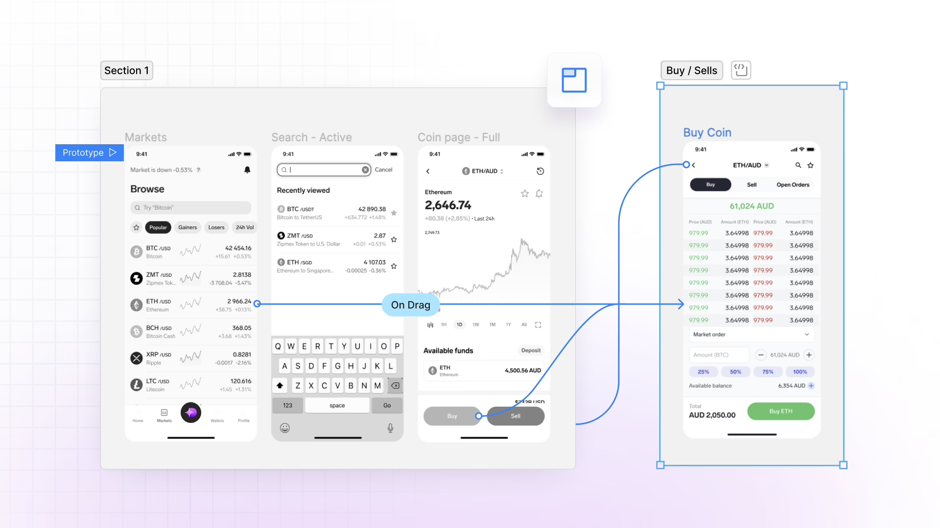
The handoff is where weak firms slip
The final phase ought to be a design system and specs for the developers: spacing tokens, breakpoints, interaction notes. Without them, you have governance failure and an interface that looks cobbled together rather than designed. We have seen stories of deadlines being sacrificed to put order to a fragmented system. An agency that hands your dev team a Figma link and nothing else has not done its job.
If you need a diagnostic before a full redesign, Refact’s UX audit practical guide offers the sort of perspective a good partner would have in an initial conversation.
A sensible proposal will follow this order:
- Discovery to put the problem in frame.
- Wireframes and flows for the logic.
- System tokens and visual design for consistency.
- Prototyping to find issues pre-build.
- Handoff assets so the engineering side can ship without question.
The Business Case for Non-Founder Buyers
When you have to justify the budget to an investor or co-founder, the case is not for prettier screens. It is about the cost of a bad call. A checkout that doesn’t handle shipping zones is going to bleed revenue week in and week out until it is redone. A confusing onboarding process means lost signups and an endless stream of support tickets. Power users will walk from a dashboard in month two if their most-used action is hard to find. Take the matter of an X case that put a finger on a 68 to 29 percent decline in drop-offs, all from a single microcopy adjustment to be more forthright about data access. One is inclined to treat such claims from a lone practitioner as directional rather than audited, but there is truth to the pattern. Measurable behavior is swayed by the small things in an interface. SaaS and ecommerce teams know this, which is why they put their money into UX at the outset, whether for a dashboard used every day or the signup and checkout process.
The rule is straightforward: design it right before you launch if you do not want to pay for the privilege of changing it later. Revenue is not something good design sits beside; it is what good design protects.
Pricing Models and What Each One Buys
When it comes to UI UX design services, most proposals will present one of three pricing structures. The choice should be dictated by how well defined your scope is, not by whichever option has the lower price tag.
A fixed-scope project is for when the problem is laid out – a redesign with set goals and an endpoint. It offers predictability, provided the scope is tight. Leave it loose and you will have change orders.
For products still in a learning phase, say a SaaS app being shipped in stages while user tests are run, time and materials is the way to go. It allows the team to make adjustments without the pretense that the scope is in stone.
And then there is the retainer, an honest arrangement for an ongoing design partner to see you through iteration cycles and new features. Most products change after launch; this model accommodates that.
You will also come across the productized subscription, touting “unlimited Figma requests” for a monthly sum. Hacker News has had its share of Show HN launches with this formula over the last year, and the reception has been underwhelming. It may suit a company with steady execution needs and a clear idea of what it wants, but unlimited requests will not solve an unclear product. If a team is all talk of speed and throughput without first establishing the problem, that is telling.
Sanity-check the quote against the deliverable
Rates in the market can be all over the place, though some bands serve as a useful smell test:
| Deliverable | Typical range | Best for |
|---|---|---|
| UX audit | $3,500 to $7,500 | Finding friction before a redesign |
| Full product redesign | $25,000 to $80,000+ | Rebuilding a product experience end to end |
| UX hourly work | $25 to $150+/hour | Smaller scopes, ongoing help, phased work |
Do not ask for the lowest number. Ask what work is actually in the scope and what is going to be quietly moved to a change order down the line. An incomplete scope at a cheap price is no discount; it is merely a deposit on the final bill.
Want the same read on your own interface? We do a free design teardown of one key page. Request a teardown.
How to Pick a Partner Without Getting Burned
A capable partner will let you in on their thinking. A case study that is nothing but a polished before-and-after with no discussion of tradeoffs is selling craft, not judgment. Put them to the test: what was the problem, what did research dictate, and would they handle it differently today? If the answer is not in plain English, they were not doing much of the thinking.
Inquire on discovery and iteration. How does the studio validate a risky flow? What is the procedure when a stakeholder wants to forgo usability testing to put two weeks back in the schedule? A vendor will not give you the same answer as a partner.
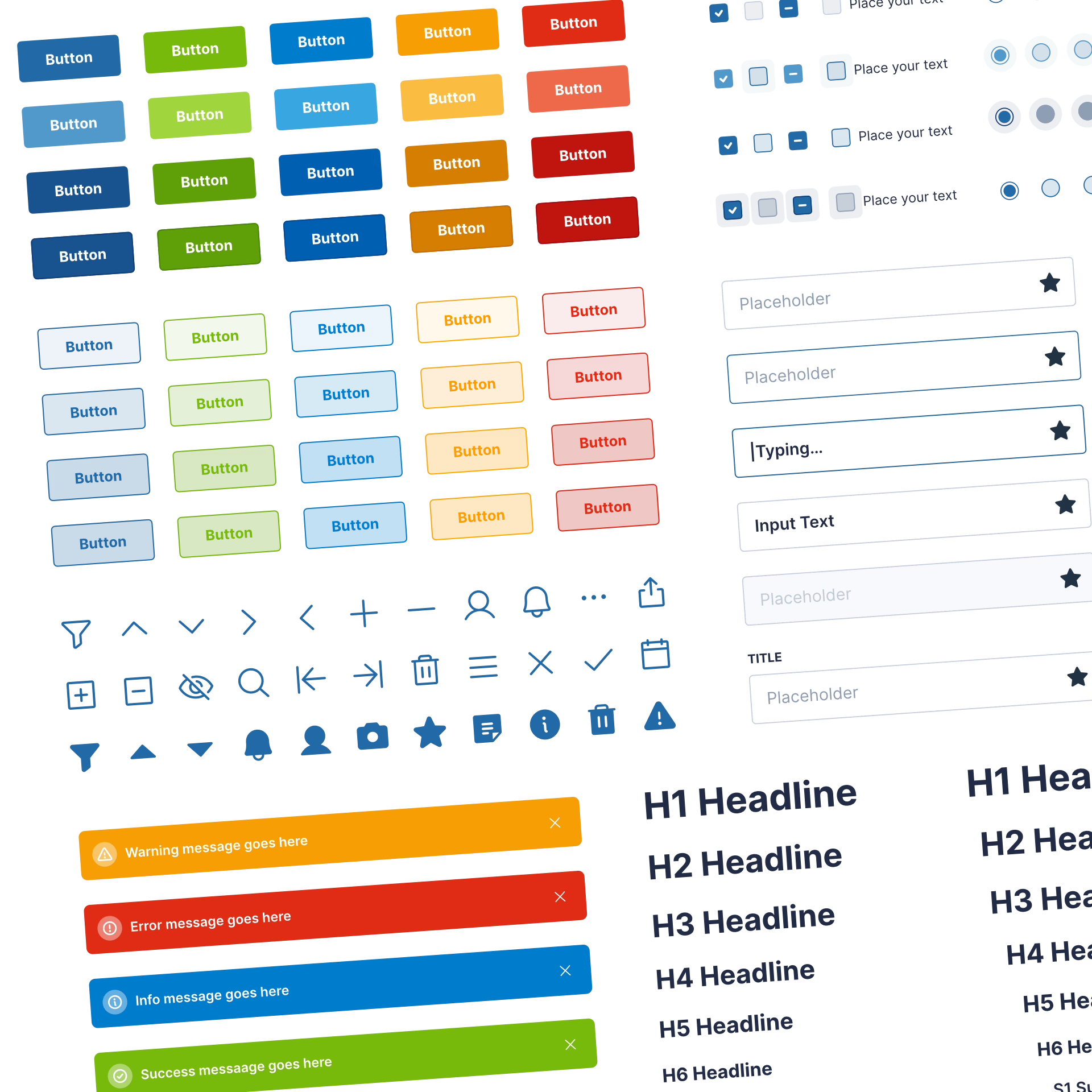
Red flags worth taking seriously
Watch for these red flags:
- No research. The team is guessing and your budget is footing the bill.
- Fixed bids on an unclear brief. Change orders will follow once the details emerge.
- Vague handoff. Build quality takes a hit when dev specs are not part of the package.
- One concept only. A good partner will put alternatives on the table.
- A portfolio of visuals with no outcomes. They made pictures, and that is all.
There is value in a paid strategy phase over a free pitch. The latter is theater; the former demands accountability since the team must prove they can frame the issue to win the build. Refact puts a money-back guarantee on our strategy phase for that very reason, to ensure we start with clarity and not risk the engagement going sideways.
For a more in-depth look at vetting questions for app work, our guide to hiring app design agencies is worth a read.
What a Real Engagement Looks Like in Practice
An engagement ought to have some structure to it, not be a mystery, and you will be making the key calls. The opening few weeks are for decisions; ceding the whole product and waiting for a miracle is how projects get off track.
With a SaaS MVP, the team will usually zero in on an anchor flow like onboarding, put together a clickable Figma file and a working prototype for engineering after the main journey is tested. For the marketing side of the house, B2B SaaS website design goes into how those sites can support the product.
Ecommerce has its own rhythm. We tend to begin with an audit and a component library, then iterate post-launch. Friction is found in the seams of cart logic and checkout. On the NudFud build, for instance, the challenge was not the checkout per se but giving the shopper enough information – nutritional stats, variant comparisons – to feel comfortable with an unfamiliar product. In the case of Broya Living’s Shopify store, we saw conversion improve by rethinking how the product narrative and subscription options played off one another, rather than with a cosmetic update. See the work we did on NudFud and Broya Living for examples.
When it comes to sorting out hiring structures for this type of work, one can do well to consult the engagement models guide to get a sense of how much collaboration is within your team’s capacity.
What the founder does during the project
The point is not to have someone simply put a stamp of approval on screens. Your partner should be in a position to field the questions that only they can: what is the priority flow, where are the edge cases, and if speed is at a premium, what tradeoff in polish is tolerable. A good one will come back with those answers early, while they are still inexpensive to resolve.
You will find that long standing relationships are built on that kind of engagement. The ones worth having do not conclude at handoff but remain involved through launch and the iterations that follow. In most cases the product matures after it has shipped and the design calls that count are made in month four, not week two.
AI, Trends, and What Actually Matters
There is no end to the chatter among practitioners about AI tools churning out full design systems in seconds, agentic interfaces, 3D UX for immersion or whatever passes for “dopamine design” these days. Some of it is merely trend churn, some will endure.
But there is a distinction to be made between execution and judgment. AI has a way of compressing the former; a design system that would have taken two weeks can be put in place by an afternoon now. Any partner who is not adept with such tools is making you pay for effort a machine could do. Yet AI cannot tell you why a flow is not working or how your users behave. That remains human work and is what makes the difference.
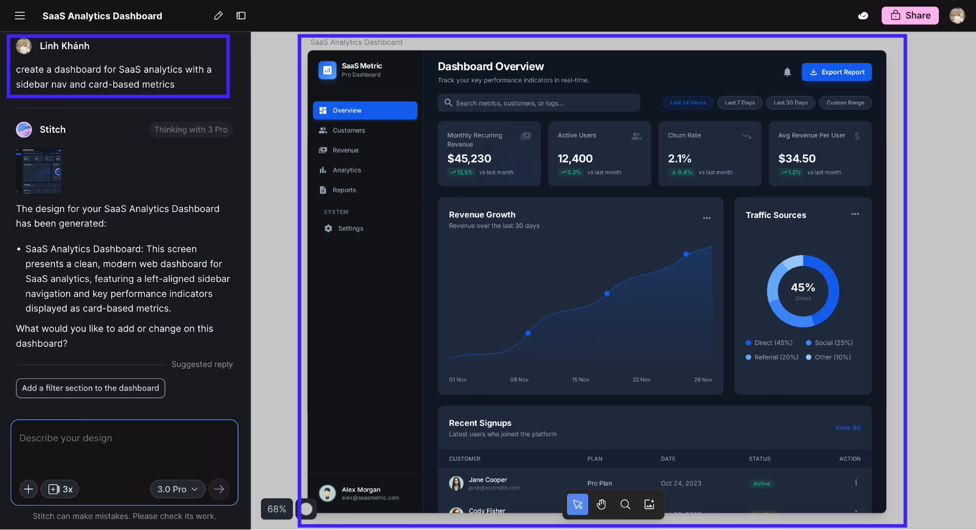
Trend labels are the same. Whether bento layouts, liquid glass or saturated color have a place in your product is a matter for your users to decide, not Twitter. Even something as pragmatic as image quality has a bearing on the perceived polish at launch, which is the value of a resource like this guide to improving web images with AI. But none of it is a replacement for knowing exactly who the product is for.
Next Steps for Hiring a Design Partner
Put the problem down in plain English to begin with. Do not say “we want better UX.” Say “users are leaving us between step two and three of onboarding,” or “the dashboard is too much for a new customer to handle,” or “engineering is at it again rebuilding the same flow.” That gives a partner substance and shows if they can form a testable hypothesis from it or just an aesthetic one.
Follow up with a request for a paid strategy phase and be clear on the output. Find out how they plan to test their assumptions and what the contingency is if the strategy is off the mark. If they are unwilling to commit a risk-reducing structure to paper, move on.
For any clarification needed before development gets underway, Refact’s product design, UX and UI design are set up to provide that early framing. Getting clarity before you write code is the least expensive decision you will make on the project. It is more than a slogan.
Sitting on a redesign you keep postponing? Let’s talk. Free 30-minute call, no pitch.

Hossein Karami is a senior frontend web developer at Refact, building the interfaces and user-facing experiences of the studio’s products. His work spans React-based applications, product UI, performance-focused implementation, and the integrations that connect frontend experiences with the systems behind them. Hossein works across the full stack when needed, bringing together design, usability, and engineering to create products that feel clean, responsive, and reliable. At Refact, he helps turn product ideas and interface concepts into polished digital experiences that users can actually work with.
More from Hossein Karami

