SaaS Website Design: A Founder’s Playbook
Most SaaS homepages fail the quiet test.


That gap is why I created this resource. The 2025 and 2026 SaaS website designs are not about beauty, but clarity, and on top of that, distribution and activation. The teams that think of their website as a final coat of paint lose to the teams that think of it as the first surface of the actual product. This resource is meant for the second group.
Why the SaaS Website Stopped Being a Brochure
Templates, AI generators, and $49 Figma kits have cheapened pretty. A three-person team can now ship auth, Stripe, dark mode, animations, and a marketing website in one weekend. The outcome is almost every SaaS homepage follows the same design: bold header, a tilted dashboard, a gradient call to action button, four feature cards, three logos, a footer.
For almost a year, designers have been complaining about this on X and Hacker News. The most upvoted Hacker News thread on this topic, “Ask HN: What are well designed SaaS websites?”, generated 191 points and 73 comments, largely because so few sites actually qualified as well designed. The deeper problem is that AI design tools trained on those same sites end up producing the statistical average, pushing new sites even further toward the middle.
When the design of different sites converges, only better positioning, honest pricing, evidence, and respect for the visitor’s time will matter. That’s where design has an impact on the metrics.
What the website is really carrying
Your SaaS homepage carries the pipeline whether you want it to or not. When it doesn’t work, you will see the effects in all three of these places:
- Leaky acquisition. Paid and organic visitors arrive but cannot identify the path meant for them.
- Low activation. New users land in an empty dashboard with no obvious first move.
- Early churn. Users leave before hitting the first useful outcome, and no email sequence rescues them.
The Studio Maydit’s SaaS conversion breakdown shows historical data in which custom landing pages converted at 11.6 percent, while template landing pages converted at 3.8 percent. For single-call-to-action pages (CTA) versus multiple CTA pages, conversion rates were at 13.5 percent and 10.5 percent respectively. These data points are historical, so take them as directional, but focus and simplicity beat visual overload and distraction.
Copy Before Design, Always
It is generally accepted that when you’re building your SaaS landing page, copy should take precedence over design. A great designer will polish and organize the ideas on the page, but a hazy positioning will render large amounts of design and typography choices useless.
Extremely common among SaaS sites stuck within our review process is the inability to explain UI/UX issues. Design agencies are hired and the Figma file is approved, but they still can’t understand why the activation potential of their product has not substantially changed. Design did its job, but more importantly, the message did not.
Lock the hero in words before you brief a designer. A working hero should answer four questions in under five seconds:
- Is this for me?
- What outcome will I get?
- Is the mechanism credible?
- What happens when I click?
A headline like “Manage everything in one platform” doesn’t answer any of these questions — it just names a category. Compare that to “Turn client requests into tracked projects” or “Cut month-end close from 8 days to 3.” The second style narrows the audience on purpose. The right visitor thinks, “That is me.” The wrong one leaves the page faster, which is fine, since they were never going to convert anyway.
Give each CTA one job
A single page can have multiple actions, but should never have multiple primary actions. Towards the top of the page, ensuring a lower-commitment link that reads “See how it works” helps the user understand the context of the page. After you provide proof and a relevant use case, a strong call to action such as “Start Free Trial,” “Book a Demo,” or “See Pricing,” is appropriate. Place it multiple times at decision points, and stop using the hero to stack three equally weighted calls to action.
What Actually Belongs on a SaaS Homepage
Strip the site down to the sections that carry real weight, and a repeatable structure emerges. This is not a template. It is a checklist of jobs, in a rough order that matches how a skeptical buyer reads.
- A real product image with a demo solution placed at the top will provide immediate value. Use a demo solution over a video, a video over a still screenshot, and a still screenshot over a laptop image.
- Following the hero, place a trust bar or logo strip if the logos are valid and recognized by your target audience.
- Workflow sections within the product should explain the steps needed to achieve that workflow as opposed to a feature matrix.
- Include sections for integrations and compatibility as the majority of SaaS buyers possess other tools and will not consider a switch to your product unless you can integrate with their existing infrastructure.
- Testimonials should display an image and role with the company they work for and one to two sentences verifying the testimonial. Generic quotes where the name is Sarah M., Marketing Director are detrimental to trust and should not be used.
- Honest comparisons should be made to the competition and/or the workaround the visitor currently uses and should include critical tradeoffs.
- Public pricing should be broken down into clear tiers, most likely three.
- Final CTA with one obvious action.
For more workflow sections and context about our recommendations, read our longer article on B2B SaaS website design that converts.
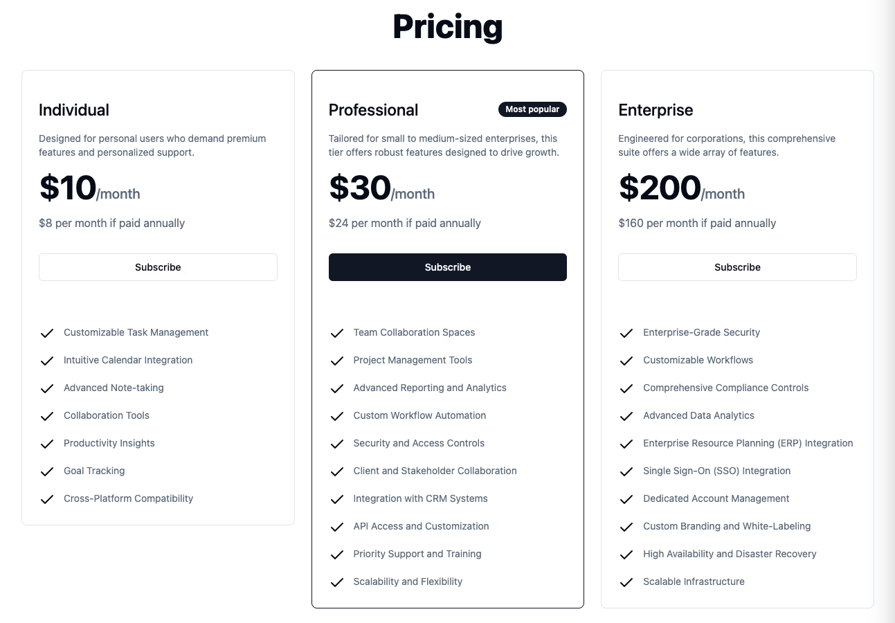
Pricing pages that help buyers qualify themselves
Pricing pages exist to help visitors sort themselves into the right tier or out of the funnel entirely. That means showing the meaningful differences between plans, explaining limits in plain language, and not hiding conditions in footnotes. If annual billing saves money, show the saved amount, not a percentage the visitor has to calculate. If pricing genuinely requires a conversation, explain what makes the product complex enough to justify it, then give buyers a clear way to ask.
“Contact sales for pricing” as the sole pricing page is an issue for modern SaaS buyers in the SME space. It demonstrates a lack of understanding of the pricing and/or an unwarranted lack of confidence in the buying customer. Either is a poor signal before a trial.
The Rule Founders Skip: Be Ten Times Better Than the Habit
A recurring pattern shows up in founder failure stories: a team ships a supposedly frictionless product that’s technically better than the old workaround, and it still flops. One founder made a digital menu that was slower than asking a waiter. The menu product was designed with a clean interface and function. The users continued to use the old method.
Your product has to be better in a big, obvious way, not in a small, incremental way. Small wins lose out to habit. This directly impacts the website. If your product is really ten times as good, the homepage should present that big difference, in a way that a skeptical visitor can see for themselves without a demo. If it only marginally improves the product, no amount of hero copy will save it, and the honest solution is to develop the product further before developing the site.
This also explains the failure of a lot of split tests. A post from Cortes Design that has 82 points and 46 comments on Hacker News argues this, saying small tweaks and A/B tests move numbers by at most three percent, and that the positioning has to be correct before testing.
Performance and Accessibility Are Design Decisions
Heavy hero videos, loading lots of font weights, animating every card, and hiding content behind JavaScript are design decisions. Performance takes shape in Figma, not in the developer’s Lighthouse report.
A benchmark in Catchpoint’s SaaS performance work says that a 100 millisecond delay would cause a 7 percent drop in signups. Each additional second of load time within the zero-to-five-second range costs roughly another 4.4 percent in conversions. Treat these as directional figures, not guarantees, but the point holds: speed is part of the conversion path, not just a technical afterthought.
Design decisions that can be found in design files:
- Images should be of an appropriate size because it looks bad to send a 2400 pixel product screenshot that will be rendered at 800.
- Limit the number of different font types and select the fonts that will render immediately.
- Animation should be used for communicating something and should not delay the loading of the page.
- Make sure to leave enough space for other elements (media) because if you don’t, the layout will jump when it loads.
- Design the empty, loading, and error states too, not just the one where everything works as intended.
Accessibility follows the same logic: keyboard navigation, sufficient contrast, descriptive link text, useful alt text, visible focus states, and clear form errors should all be planned in from the start, not patched on later. Similar logic is shown with twenty SaaS design examples, and early integrations of these designs help sites meet Core Web Vitals targets specifically LCP targets under 2.5 seconds.
Trust Signals Placed Where Doubt Lives
Trust signals don’t work as decoration. They work when they’re placed right next to the moment a visitor starts to hesitate. Customer logos after the hero section are a proven trust signal. Placing security or compliance badges on the pricing page, and/or on the trial form also helps alleviate concerns of procurement reviewers.
The HomepageAuditor trust signals resource says, most founders place reassuring logos far from where troubles occur, thus placing proof backwards, whereas one should place reassuring logos where trouble is most expected. These concepts can be further researched by looking at procurement-dominant environments; this enterprise trust signals resource is a great start.
Real examples are far more powerful than generic examples. Detailed descriptions of results are better than simple compliments, unless you are able to verify the results. If you do not have results, provide the customer’s journey in as much detail as possible. For example, “We used to take a week to close the books, now it takes us only three days.” Peers can read into the example and better understand the result. Simply stating, “Great product!” etc., is unhelpful.
Onboarding Is Part of the Website
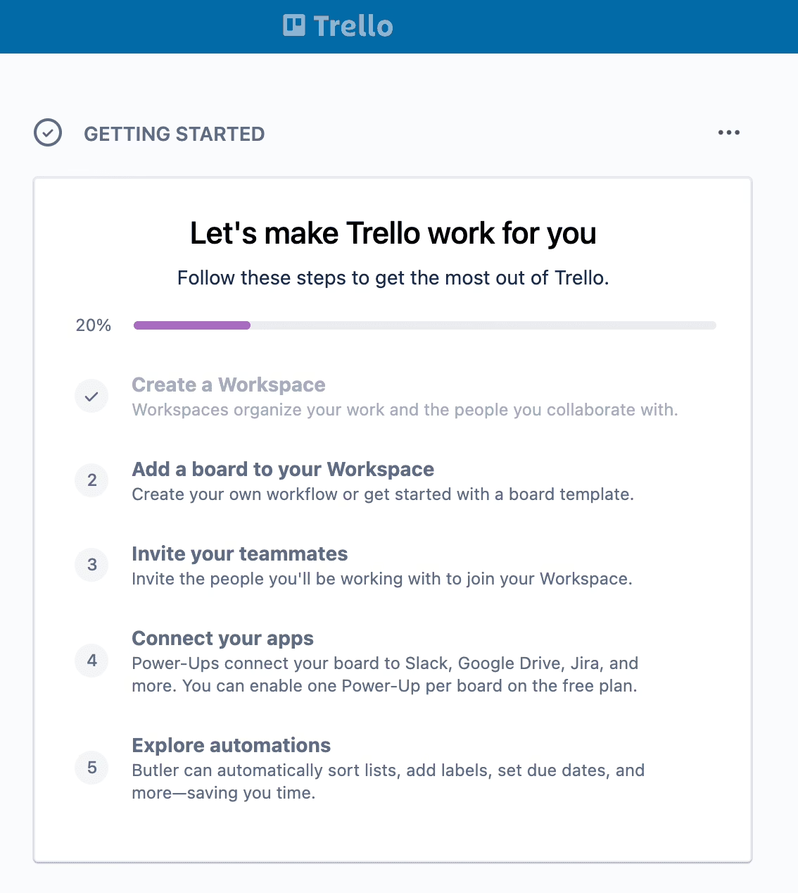
The product must deliver on what is promised in the marketing description. If your product claims to offer “faster reporting,” after the sign-up, your user should not be dropped into an empty dashboard. Instead, the user should be guided to the reporting page to either create or view a report.
Empty states are great opportunities for clear instruction. An empty project should not display “No data yet.” It should describe the expected data and include instructions to add the data. Checklists are useful for new user onboarding only if each newly added action is used to accomplish a task in your product, rather than celebrate an achievement like the user completing the sign-up.
When we rebuilt Stacked Marketer’s site and dashboard, the real work wasn’t the homepage refresh — it was making the post-signup experience match what the marketing pages promised, so the newsletter, paid community, and dashboard felt like one connected product instead of three separate ones. That link between the marketing surface and the product surface is where activation actually happens.
Measure the Things That Actually Predict Revenue
Lack of measurement after a redesign is essentially forming a new opinion about the same problem. You should determine what success will look like for each step of the funnel prior to the redesign. A realistic Five Metric Baseline for SaaS Redesigns includes conversion rate for each source, bounce and exit rate, scroll depth, form completion rate, and click-through rate for CTAs. Take a record of those prior to making any changes to the site so you have benchmark data to compare to.
Next craft a revenue event taxonomy. This includes homepage CTA click, signup initiated, signup completed, first key onboarding action, first valuable product interaction, pricing page viewed, demo requested. Dashboards should help answer the following: who are the visitors who convert, where do people leave the signup flow, and which page qualifies people to view the pricing. Everything else is vanity.
The biggest area of uncertainty should be your first A/B test. Headline, primary call to action, and Pricing are usually the areas of the greatest uncertainty. Do not run more than one test at a time, and do not call an A/B test a winner until more than three days have passed. Read our article on Landing Page Conversions for more ideas on instrumentation prior to spending money on traffic.
The Design-to-Engineering Handoff That Survives Launch
A Figma file may not convey all of the information that a developer needs to build a website, even a pretty one. Some examples of missing information include mobile states, hover or interactive elements, empty or error states, content rules to define how much and how little information can be included, etc. If these design considerations are retained in the designer’s mind instead of the file, we may notice a lack of production polish after six months.
An ideal handoff contains design tokens for color, type, spacing and radius, responsive components, and defined interaction states. There is a lot more to consider, and we have outlined this further in our Figma to Webflow handoff guide. The same principles apply to Next.js, WordPress, or any other technology that needs to be built.
A lack of forethought in the CMS structure is also a problem. If a marketing team can’t create a new landing page without development, it will hold up every campaign. Make sure you create a CMS structure so new pages can be built with approved patterns.
The Emerging Question: Designing for AI Agents
There is an interesting discussion among practitioners for the future build of SaaS web apps. Some say that in 2026, web apps will need to have two target audiences: humans, and possibly AI. If you are building any of these web services and want to give AI crawlers access to your app, then JSON-LD, llms.txt files, webhooks, audit logs and MCP endpoints would need to be added to your site. There is not a lot of information to go off of right now and we cannot predict how valid these claims will be in a few years.
The evidence base is lacking. This claim is forward looking, and is based on only a few voices. The presumed best course of action is to implement the baselines for SEO and structured data because it improves search for humans and is cost-efficient. The machine-first deep infrastructure is worth monitoring, not building at this time. If your product is one where agents can possibly automate the buying process, be proactive. If it is not, take the human path.
A Founder Checklist Before You Commission or Rebuild
You can use this to review an existing website or to brief a new one. If you are not able to answer “yes” to most of these, take the time to restructure the message and the layout. Once that is done, you should consider visual design.
- Messaging Clarity. Ten seconds. Can a visitor correctly articulate the product to you?
- Hero Test. Does the Hero respond to the prompts: is this for me, what result can I expect, is the product believable, what happens next?
- Visual. Is the product’s representation a real design, not a drawing?
- Prioritization. Is there just one primary call to action in each section?
- Pricing. Are potential buyers able to select between pricing plans without the need for sales contact?
- Testimonials. Are the quotes attached to names, job titles, and associated circumstances?
- Competitors. Do you describe at least one disadvantage to all listed competitors?
- Form. Do the form fields support validation on-the-fly?
- Value. Does the application’s first screen fulfill the promise of the landing page?
- Guides. Do the empty screens provide instructions as to the next appropriate action?
- Design. Are the Core Web Vitals included in the design review?
- Accessibility. Can the site be navigated with the keyboard, are focused controls visible, and the contrast satisfactory?
- Baseline. Prior to the redesign, are the five essential analytics in place?
- Handoff. Is the design represented in design tokens and defined in the provided states and content management system?
- Friction. Is doubt mitigated by proof of security and risk reversal?
UX audit. A thorough UX audit will identify the majority of these issues before the need for an extensive redesign and is a cost-effective first step that does not require the creation of new Figma files for an open-ended brief.
Where This Leaves You
The SaaS teams whose sites convert in 2026 won’t be the ones with the flashiest visual polish. Those sites will be built by teams that write copy before they design, publish pricing without hedging or apology, and put proof right next to doubt. They will treat the signup flow as an integral part of the product. Everything else boils down to the craft of communication.
When we rebuilt Teton Gravity Research’s platform, the hardest part of the project was the first 80%—getting the team to think about what the platform needed to do, what needed to stop, and how the marketing, publishing, and business elements of the platform needed to work together. That order matters. Design decorates decisions. It cannot make them for you.
If you are unsure if your current site is still suffering from a problem in the message, structure, or execution prior to a legitimate rebuild cost, that work is what our UX design and product design engagements are meant to address. Bring your current site with you, your funnel data, and the one area of the site you know is confusing to visitors. We will engage there first.
Building a product and unsure what to scope first? Let’s talk. Free 30-minute call, no pitch.

Hossein Karami is a senior frontend web developer at Refact, building the interfaces and user-facing experiences of the studio’s products. His work spans React-based applications, product UI, performance-focused implementation, and the integrations that connect frontend experiences with the systems behind them. Hossein works across the full stack when needed, bringing together design, usability, and engineering to create products that feel clean, responsive, and reliable. At Refact, he helps turn product ideas and interface concepts into polished digital experiences that users can actually work with.
More from Hossein Karami
