B2B Website Design That Actually Wins Buyers
When a B2B buyer gets to your website, the deal is well underway.


We put this together for the teams who run or plan a B2B site and have had enough of overhauls that are all style and no substance. What follows are not rules of aesthetics. They are the patterns that allow a buying committee to educate themselves and build trust on their own terms, and we point out the errors that will put a stop to pipeline before sales even has a name to put on the account.
The Website Is Now the First Sales Call
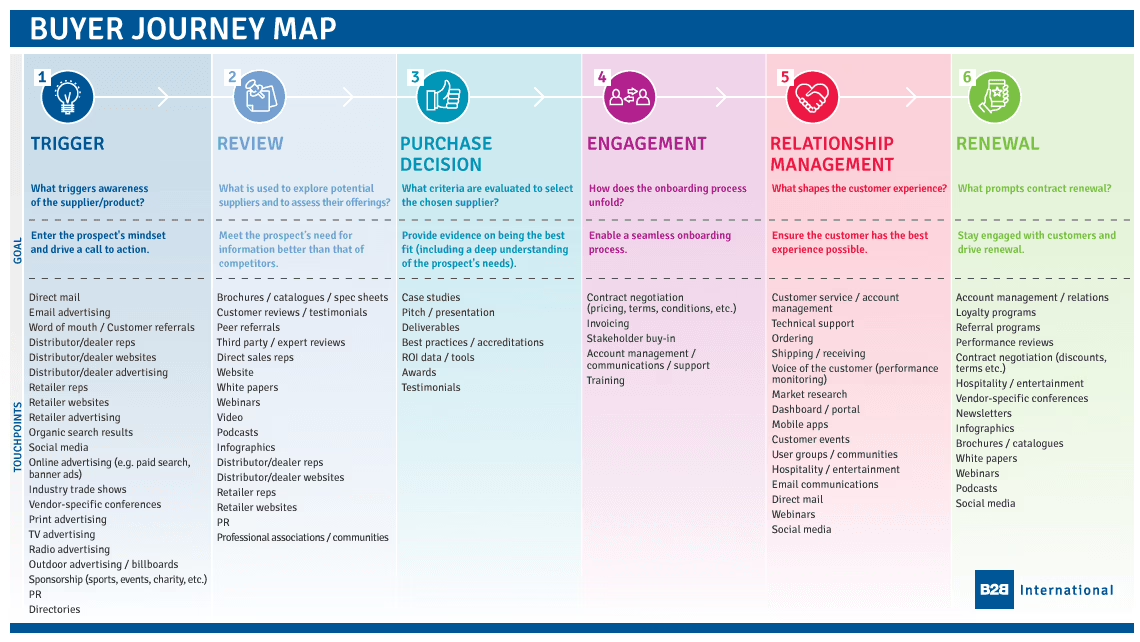
Consider the typical B2B committee: three to seven people between the economic buyer, the champion, someone in security and finance, and the practitioners who will put the product to use. You will not see them on your site at the same time. They will share links, screenshot pricing for Slack and quietly disqualify you before a demo is booked. Forrester says 86% of B2B purchases come to a standstill in the process and 81% of buyers end up dissatisfied with their choice. A good deal of that is your website’s doing.
The design implications are straightforward. A CFO and a platform engineer are both looking at the same deal, one at your pricing, the other at integrations. Each page must satisfy both without wasting their time. Confuse either of them and the deal is over in a room you will never be in.
If the last thing you did was a brand refresh, you may be noticing it now. The traffic is there but form fills are flat, and the few deals that come through are asking things your site ought to have put to rest. It is time to put down the hero copy and reconsider the purpose of the place. We cover how to make that reset in our guide to a B2B website redesign before any of the visual work begins.
Design for the Committee, Not the Persona
Do not rely on the persona template you were taught in marketing school; it does not serve B2B. “Marketing Mary” is not the one signing off on a six-figure contract. A committee is, and they are not an archetype but a collection of jobs to be done.
You need an information architecture based on tasks. Let the buyer figure out what you do, compare you to the rest, vet your security and cost, and see some proof from a peer company. Ditch the menu built around your org chart for something standard. If a security lead can get to your Trust Center in a single click, you have done better than most.
Put the needs of the person who can block the deal if left with questions above those of the internal site owner.
How B2B Design Differs from B2C, in Concrete Terms
There is a world of difference between the B2C model, which is often an impulsive, one-person decision made on a phone, and the weeks or months it takes for a multi-role B2B process. That dictates the system, not just the voice of the copy.
| Dimension | B2B site | B2C site |
|---|---|---|
| Audience | Buying committee, three to seven people | Individual buyer |
| Decision length | Weeks to quarters, multiple visits | Minutes to days |
| Primary conversion | Demo, pricing, security page, ROI calculator | Add to cart, subscribe |
| Proof style | Named case studies with quantified outcomes, logos, compliance | Reviews, ratings, urgency |
| Navigation | Task and role based, exposes pricing and docs | Product browsing |
| Content depth | Deep, plain language, self-serve evaluation | Short, emotional |
And while a certain level of polish is expected, it is no longer what sets you apart. Enterprise buyers are vocal about the credibility risk of a vendor with a 2015 site, no matter how well funded. The question is whether a serious buyer can get through their evaluation without having to put in a request to you.
The Hero, the CTA, and the Five-Second Test
Try a test on your homepage: read the hero out loud and see if you can name the problem, the outcome and the buyer in one sentence. “Compliance software for hospital systems that need to pass a Joint Commission audit” is a filter. “Accelerate your digital transformation” is just a mood.
Apply that to your CTAs as well. We have seen four buttons across the top for demo, trial, contact and pricing underperform a single primary action put in context. For enterprise it is “Talk to sales,” for product-led a sandbox. Put it where the decision is being made. And let the trust proof sit with the claim it supports. If a case study touts a 40% drop in reconciliation errors, put that figure beside the CTA on the page for finance, not three scrolls down in a logo strip.
Accessibility and Performance Are Now Procurement Filters
Then there are two things that are no longer optional if you want to sell, yet many B2B teams still think of them as mere polish.
Accessibility is one. With the U.S. Department of Justice finalizing its rule under ADA Title II in April 2024, WCAG 2.1 Level AA is the new baseline for state and local government. The deadlines are set for 2026 and 2027 depending on population size. For anyone in public sector, healthcare or education, this is an RFP requirement. An automated scanner will only get you so far. You will not get through an audit with a keyboard and screen reader if you have simply bolted on an “accessibility overlay.” In fact, those are prone to failure and can put up new barriers. Manual testing is the only way to be sure.
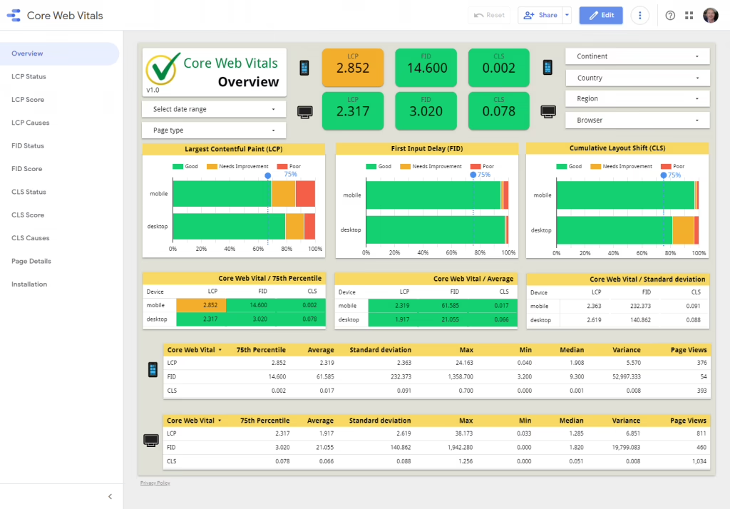
Then there is the matter of performance. Google’s Core Web Vitals do not leave room for interpretation: LCP has to be under 2.5 seconds, INP below 200ms and CLS under 0.1. The data from Google and Deloitte is clear that a tenth of a second in mobile speed can mean an 8.4% bump in conversions. Yet on a corporate laptop behind a VPN, a heavy marketing site cobbled together with a page builder will miss every one of those metrics and you will not even know the deals it has cost you.
The solution is not to add another plugin. You need a design system with accessible states as part of the component, a performance budget in your CI and an editorial process to stop the marketing side from pasting yet another analytics script in the header come launch week. For a checklist that makes these constraints hard to ignore, we have put together our website redesign checklist around these very failure modes.
Content That Serves a Buying Committee
Keep self-serve evaluation in mind. A buyer who cannot find an answer on your own will either go to a peer in Slack or walk away. A B2B site should at least provide:
- Pricing, even if it is a range.
- A Trust Center that is forthright about data handling and sub-processors.
- Case studies with quantified results and enough detail to be credible.
- Docs and API references a technical person can read without having to log in.
- Comparison pages that make honest trade-offs rather than pot shots at the competition.
There is always debate over pricing. While enterprise requires some back and forth, SMB and product-led motions want transparency. Hiding everything behind “Talk to sales” is a filter for serious buyers. The sensible approach is to publish enough to weed out unqualified traffic but retain the flexibility for negotiation.
Enterprise deals have a habit of stalling on the security stack. An AE can be 40 minutes from closing and then the prospect’s security team wants the SSO guide and an explanation of your admin permissions model. If those pages are out of date, you have lost two weeks. Gitdoc has a good piece on documentation for enterprise sales for keeping things current.
The Platform Decision Is About Change, Not Taste
Choosing a CMS comes down to how technical your team is and how often marketing needs to ship. HubSpot is a clean fit if you want lead workflows tied into the CRM. WordPress offers an ecosystem and flexibility but demands more governance to control the plugins and performance. Headless is fine for multi-region operations but a small marketing team will chafe at the extra engineering surface area.
What we see too often is a stack the internal team cannot handle once the project is done. A custom site that no one can update becomes a line item on an agency bill and a minor tweak is a change request. Run with a platform you can manage. And when you move off one, safeguard your SEO and forms before you start on the visuals; our website migration services are there because most redesigns lose value in that transition.
Take Teton Gravity Research. Rebuilding their platform was less about the design and more about moving 10,000 articles from a legacy CMS without upsetting search rankings. We saw the same with SingularityHub; the visual refresh was superficial, the real value was in a content model editors could work with.
The Redesign Failure Pattern, and How to Avoid It
If you listen to practitioners, they will tell you the same story: aesthetic-first briefs, org-chart navigation and no baseline to measure against. On Reddit they will say most B2B redesigns do not deliver. The pattern is undeniable.
Plan for it like a product. Have a single decision-maker and set measurable goals before you draw anything in. Do a phased release and make a quarterly CRO review part of the routine. If you cannot point to better demo requests or sales velocity, you have not run a redesign so much as a repaint.
And do not let the interruption stack take over. Cookie banners, popups and chat widgets on top of a slow hero page are a poor preview of the product for a buyer. Show some respect for their time and they will do the same for your sales people. How to redesign a website is a framework for making those calls without ending up with something worse than what you had.
The Sales Enablement Layer
Think of the website as just one surface. It has to coexist with the very tools your sales team relies on to work the deals that come from it. Most teams would not tell you how important it is to have alignment there. HuntingAlice makes a good point in their take on B2B sales tools for 2026: the site is meant to set up a well-qualified conversation, not to close by itself. Should your CRM or enrichment tools be unable to make use of what the site puts in front of them, you will be leaving pipeline on the table.
A Pre-Build Checklist Worth Filling In
When you are ready to sit down with a studio, have your answers to these five questions in writing first. They will be a better indicator of the project’s potential than any proposal.
- Primary goal. Is it more demos, a cleaner enterprise handoff, or faster cycles? Choose one.
- Buying committee. Identify the three roles that count in your deals and the principal question they put to you.
- Proof assets. What are the five most credible items you can show a sceptical buyer right now?
- Baseline metrics. Know your current demo request rate, mobile Core Web Vitals and conversion numbers.
- Post-launch cadence. Once the site is up and running, who is responsible for CRO and the quarterly reviews?
You will find B2B sites don’t fail on aesthetics. They are usually briefed as brand projects when they should have been re-scoped as revenue systems. If the aim is to get clear on what the site must do prior to any design, Refact’s UX design engagement and product design work are suited to that kind of early decision making. We put a money-back guarantee on discovery to keep the first phase honest.
Building a product and unsure what to scope first? Let’s talk. Free 30-minute call, no pitch.

Hossein Karami is a senior frontend web developer at Refact, building the interfaces and user-facing experiences of the studio’s products. His work spans React-based applications, product UI, performance-focused implementation, and the integrations that connect frontend experiences with the systems behind them. Hossein works across the full stack when needed, bringing together design, usability, and engineering to create products that feel clean, responsive, and reliable. At Refact, he helps turn product ideas and interface concepts into polished digital experiences that users can actually work with.
More from Hossein Karami

