B2B SaaS Website Design That Converts
There is a test that most B2B SaaS homepages do not pass.


The numbers bear this out. Valmax’s 2026 SaaS website benchmarks show the average B2B SaaS converting visitors to leads at 1.5 to 2.5 per cent. The top decile are in the 8 to 15 per cent range. Put simply, when a site is viewed as a revenue system rather than a piece of design, the same volume of traffic can yield four to ten times the leads.
We have put together this guide for teams intent on making their B2B SaaS design work hard enough to secure demos and shortlist placement. You will find the patterns that convert, the copy discipline required, and the operational habits to ensure a redesign does not quietly erode your pipeline.
Why B2B SaaS Website Design Fails Differently
You cannot rely on feeling to win in B2B SaaS the way a consumer site might. The buyer on your homepage is already sizing you up against two other vendors in the tabs next to it. They are likely one of five or ten in a buying group, all after something different: the end user is looking for workflow, the manager for team fit, the executive for less risk.
Vague positioning is more harmful than poor aesthetics. Practitioners will tell you the hero copy is at fault, laden with “AI-driven” or “next-gen platform” type verbiage that could apply to any vendor. In one Framer community discussion on B2B homepage missteps, the consensus was that visitors are gone in five seconds because the page is describing a category instead of a problem.
Then there is the matter of proof being hidden three scrolls down. An 81% figure from a 2026 study has been cited often; procurement heads say they have dropped a vendor from a shortlist over a website that did not inspire confidence for the size of the contract. While that data point is directional, the pattern holds true in B2B: if trust is not legible on the first screen, it is not there.
What the Homepage Has to Do in Five Seconds
A good homepage must answer what it is, who it is for and why to trust it before the buyer has a chance to scroll.
In practice that means a headline of no more than twelve words, a primary CTA and some customer logos right below. And by visual we mean the product as a buyer would use it, not an animated abstraction or a moodboard.
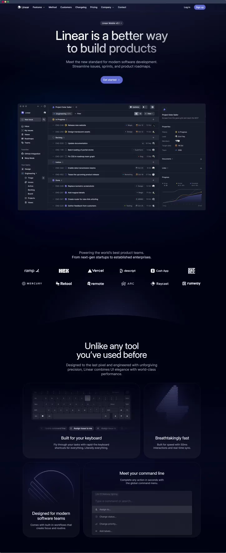
The performers are unapologetically boring about it. Linear, Vercel, Clerk and Cal.com all make a specific claim and offer a single next step. Take Clerk’s authentication demo for instance; the visitor gets to see the product in action rather than a static image. Some have reported a 28% bump in demo requests from swapping stock for actual UI in their tests. It is a number from one study but every teardown in the research points in the same direction.
From that we draw two rules:
- Illustrations should come after real screenshots or embedded micro-demos.
- Quantified proof and named logos belong near or above the fold, not sequestered on a trust page.
If your hero section could easily be your competitor’s, rewrite it to focus on a job done for a particular person. That will do more for you than another round of design tweaks.
Information Architecture for Buyers Who Compare in Tabs
Complex products do not lend themselves to single-page storytelling. The homepage cannot be all things to buyers of different intents. There is a set of pages that move the needle – product, pricing, case studies, security, comparisons and so on – and everything else is ancillary.
Keep top navigation to five or seven items at most. An extra link is just an invitation to leave.
Two calls are more important than the rest:
- One goal per page. If you give “start free” and “book a demo” equal billing on the homepage, the visitor will likely do neither. Go with the one that aligns with the strongest intent.
- Segment by product line. Persona-based pages are a nice idea until you realise they have no volume. Product-line pages let the buyer find what they need without the complexity.
For those undertaking a full rebuild as opposed to a refresh, our B2B website redesign guide goes into how to handle the technical and SEO side of things so the new site is not merely prettier but also converts better.
Copy That Sounds Like a Competent Person Talking
SaaS copy has a tendency to fail in three predictable ways: it talks about the product and not the problem, it uses the language of the category and relegates the CTA to an afterthought.
A better approach is to lead with the outcome. “Close month-end in a day” tells a buyer what is changing; “AI-powered financial close automation” is just a label. And when it comes to the CTA, be explicit. “See a 15-minute product tour” leaves no doubt as to what the visitor is signing up for, whereas “Get started” is meaningless. Take the case of a practitioner who saw demo requests jump 19% after putting in a persistent secondary CTA. You can put the 19% down to variance, but the underlying principle is sound.
It is the same with how one presents features. A feature block ought to be about the work it does for the buyer – what they are no longer required to do – rather than a recitation of technical capabilities.
Pricing should be subject to that kind of discipline. The 2026 landscape for SMB SaaS is pointing in one direction: named tiers linked to actual use cases, a summary of features on display and some low-friction way to “Start for free”. While enterprise deals may still warrant a form to gate pricing, you will alienate the self-serve prospect who was ready to qualify on his own. It is a matter of control versus friction, and too many teams put too much weight on the former.
If one wants to understand the mechanics of converting traffic, our write-up on how to increase website conversion rate goes into the audits and minor adjustments that have an immediate effect on the numbers.
Performance Is Part of the Pitch
There is an unspoken query from a visitor when a SaaS site drags: if the marketing is this ponderous, what of the product? A study of B2B SaaS buyers found 74% would let a slow site erode their confidence in what they were being sold.
Performance guidance such as Spike’s article on B2B SaaS design will tell you to aim for the Core Web Vitals thresholds.
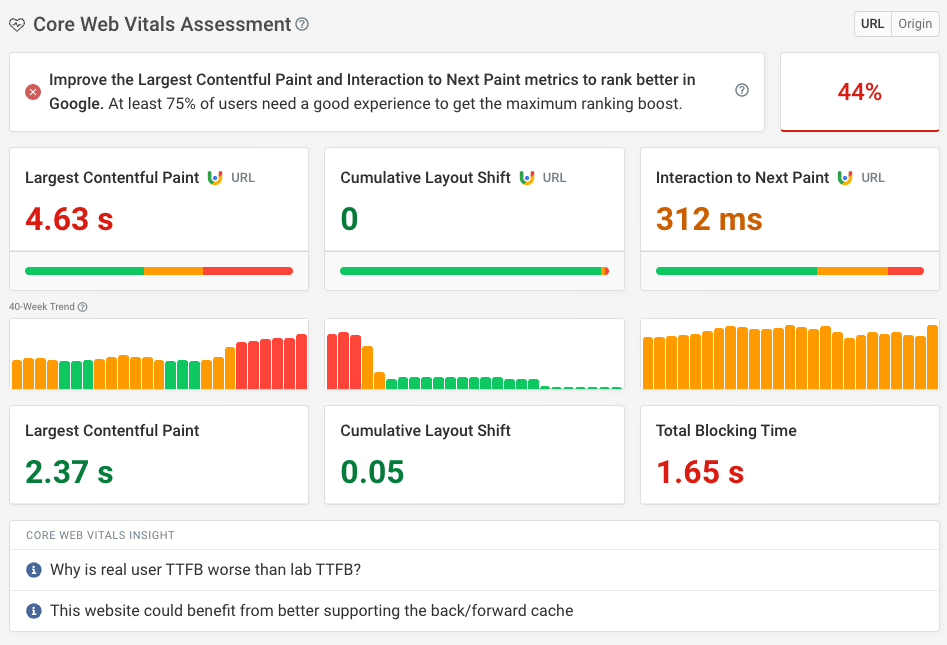
| Metric | Target | What it measures |
|---|---|---|
| LCP | Under 2.5s | Time to the largest visible element |
| CLS | Below 0.1 | Unexpected layout shift |
| INP | Under 200ms | Responsiveness to interaction |
You can see from the reference sites that these are within reach. Vercel is at about 0.6s mobile LCP; Linear 0.8s; Clerk in the neighbourhood of 1.1s and Cal.com around 1.3s. And they are not bare-bones for it. They simply eschew the hero videos, third-party scripts without instrumentation and uncompressed images.
The necessary work is not particularly glamorous:
- Size and compress your above-the-fold images properly.
- Defer the non-critical scripts, like an analytics stack that needs five tags just to load a form.
- Put a performance budget in place for each component at the design stage, not as an afterthought at launch.
- Make sure there is room for embeds and images so the layout does not jump around.
One might report a 34% lift in demo requests by bringing INP down from 500ms to under 200ms. Even with a healthy discount on that number, the trend is evident. Do it before you start with the animation.
Redesign Without Measurement Is a Coin Flip
Redesigns can be detrimental to the pipeline when the team has not taken the measure of the old site first. They go by opinion, put out something prettier and then find months on that the demo request rate has fallen for no apparent reason.
Two things put right what ails this:
- Do an audit of the existing site. Use session recordings, heatmaps and search console to see where people are dropping off before you make any changes. We have a UX audit process for precisely that.
- After you have launched, test a single variable. If you overhaul the CTA, navigation and pricing in one go you cannot tell what won or lost. Ship in increments or instrument every surface so you can roll back a regression.
Audits of over forty B2B SaaS sites tend to come up with “poor content design” as the chief complaint, not visual design. Something to bear in mind before ordering another visual refresh.
What This Looks Like in Practice
We saw it when we put together the new platform for Stacked Marketer. The real leverage was in making the paid tier legible in the dashboard experience, in having a tighter hero and genuine product visuals instead of illustrations. The design refresh was the last thing anyone noticed; the architecture of the offer did the work.
That is the pattern. The best converting sites are not the most ornate. They have a page with a single purpose, the proof comes before the ask and the technology is unobtrusive.
A Short Checklist Before You Redesign
Ask yourself:
- Will a new visitor know what the product is in five seconds?
- Is there a screenshot or interactive demo above the fold?
- Are there customer logos by the hero?
- One primary CTA per page, with copy that tells you what comes next?
- Does the pricing page give a self-serve buyer enough to go on?
- Are LCP, CLS and INP on target for mobile?
- Have the analytics and redirects been put in place ahead of time?
If the answer is no to more than a couple, you do not need another design cycle. You need some landing page conversion work on the highest-intent pages.
Where to Start
For the majority of B2B SaaS operations a full rebuild is superfluous. What is called for is a homepage that makes its point in five seconds, a pricing page for the self-qualifying buyer and a performance floor that does not let the pitch falter. The rest of it, the case studies and comparison pages, is for winning the second visit.
Should a migration be part of the plan, make SEO and analytics launch-blocking issues rather than something to deal with on the day. Our WordPress migration checklist will walk you through the cutover rehearsals and serialized data that keep your traffic safe.
A site may be drawing in visitors yet still fall short on qualified leads; more often than not, the problem can be traced to a handful of pages. We put that kind of constraint to light before any design work is done at Refact. Our product design approach is meant to ensure a redesign puts better numbers on the board rather than just altering the mood. Should one want to see what a contemporary B2B operation ought to be doing, the logic of the buying committee is explained in our guide to B2B website design that wins buyers.
Building a product and unsure what to scope first? Let’s talk. Free 30-minute call, no pitch.

Hossein Karami is a senior frontend web developer at Refact, building the interfaces and user-facing experiences of the studio’s products. His work spans React-based applications, product UI, performance-focused implementation, and the integrations that connect frontend experiences with the systems behind them. Hossein works across the full stack when needed, bringing together design, usability, and engineering to create products that feel clean, responsive, and reliable. At Refact, he helps turn product ideas and interface concepts into polished digital experiences that users can actually work with.
More from Hossein Karami

