Figma to Webflow: A Handoff That Holds Up
Looks fool us all.


This guide is not about how to make the handoff look good in a design review. It’s about how to make the handoff work in production. This guide aims to solve the issues in Figma that are required to be fixed in order to use Webflow, how to relate components to symbols and CMS collections, where the box model will cause headaches, and what is required to be done manually regardless of which plugin or AI agent is used.
Why Most Figma to Webflow Handoffs Break Down
The most common failure is a false assumption. Rarely do clean design files map to clean implementations on the web. Figma captures the designer’s arrangement of pixels at two or three widths. Webflow needs to define the real flex rules with real padding and margin rules at every breakpoint with states. Webflow and Figma capture two completely different things.
The Figma to Webflow handoff handbook states that even though both use terminology like components, variables, and breakpoints, they both operate on different levels. For Figma, a component is a design pattern. A Webflow symbol is a DOM template. A Figma variable is a token. A Webflow variable is a CSS custom property class. Most of the work involved in a handoff is in this gap.
Just as X’s users keep drawing the same conclusions, those conclusions reflect the reality that the plugin is not the deciding factor. Rather, what dictates methodological success is the quality of the file prior to the export: whether the design components were reused, whether the spacing was accomplished using auto layout and not by nudging, and whether each color, radius, and type ramps had a token assigned to it. Without these guardrails, no plugin and no AI is going to result in a positive outcome. Even a manual rebuild is eased by them.
A founder generally experiences this as unanticipated rework. The designer states that the file is complete. The developer states it requires additional work. The estimated completion time is significantly greater as there was no prior consensus regarding the structure.
Preparing Your Figma File So It Behaves Like a Build Spec
The optimal handoff experiences typically occur prior to Webflow opening, and the file should behave like a build spec, not a mood board. In Figma, the design team should make decisions that a developer can replicate without thinking.
Build around structure, not decoration
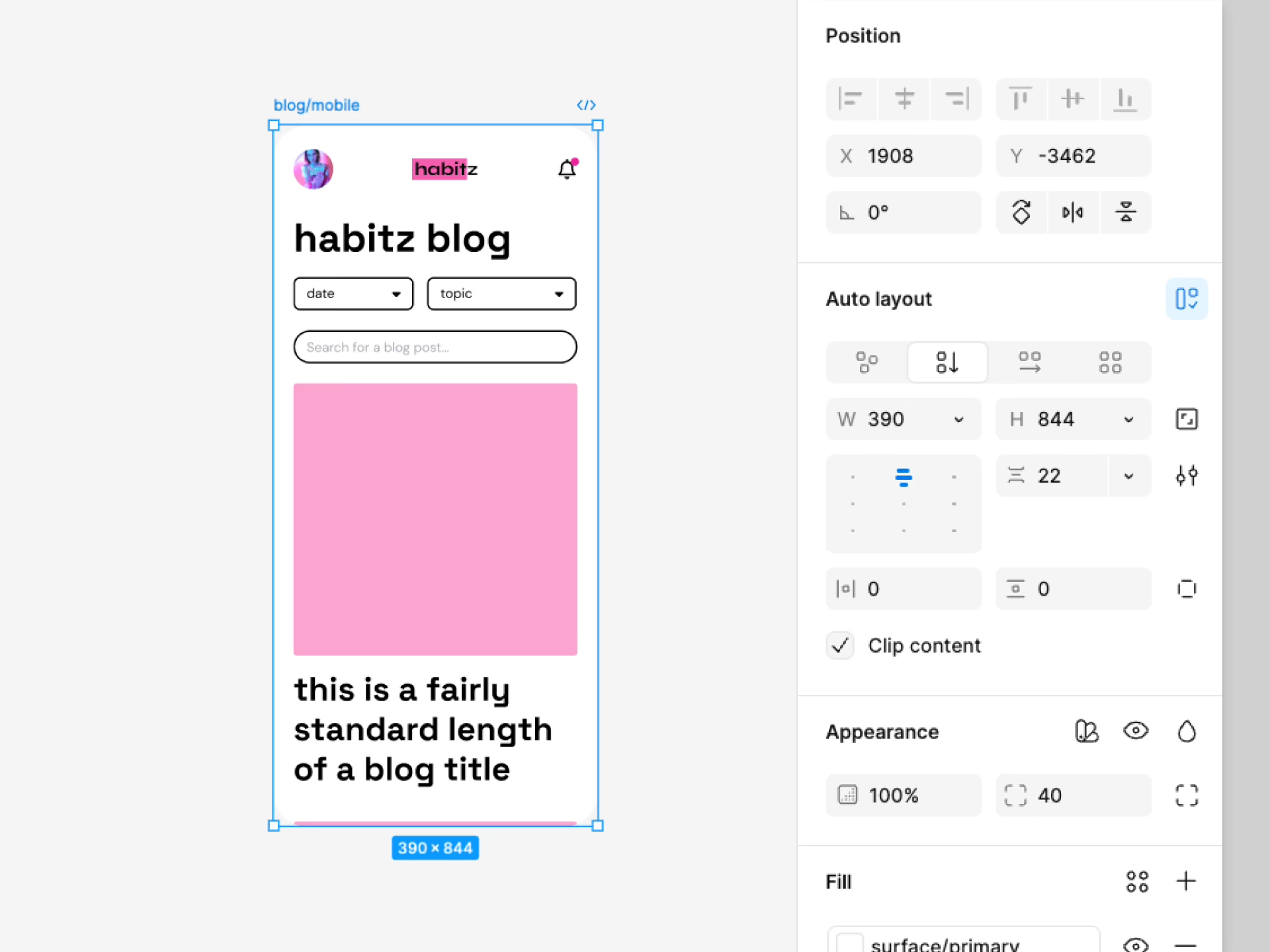
Position elements using auto layout if content allows for shrinking, growing, or wrapping. While absolute positioning looks neat in an invisible frame, it conceals the logic which Webflow uses to develop the page. Create a framework for each key design component and give each a name that a developer identifies with. A named component like “hero-with-form” can be built. A component like “Homepage v3 final FINAL” cannot.
Make sure design tokens stay consistent between both tools. Name matching for colors, spacing, radius, and type are some examples. When design tokens are consistent, class drift decreases. Class drift occurs when people define terms differently. A month after one person calls a term “card padding,” and another calls the same thing “surface spacing,” there are classes for the same thing, and no one knows which definition is correct.
Clean up before export
Some habits will save hours of rebuilding work.
- Name components semantically. Use names like hero-banner, card-list, or testimonial-block. Not visual labels that only make sense inside Figma.
- Separate exploration from production screens. Keep drafts in their own pages so the import tool does not read a scratch frame as a final asset.
- Convert vectors with intent. If an icon or illustration needs to become an SVG in Webflow, decide that before handoff. This is one of the most common Stack Overflow questions on the Figma-Webflow tag, and the fix is upstream, not downstream.
- Define breakpoints early. Agree on how the design behaves at mobile, tablet portrait, tablet landscape, and desktop before the first import. If the file only has two states, the middle widths are being guessed at.
For more tips on how to work with the responsive design features, refer to the responsive design services page. The goal is to not use additional software. The aim is to have the build be as design-focused as possible to avoid design elements being an afterthought.
The Box Model Gap Between Figma and Webflow
The most difficult part about the handoff process is that while both tools can show the same layout, they can both take different paths to get there. Most designers use Figma, where design elements can be positioned anywhere inside of a container. Webflow is more like CSS where everything is contained in a parent element with flex and grid or with padding and margins.
It is most prevalent in the middle widths. Lines can appear balanced in Figma but collapse at tablet sizes. The spacing was not defined as a rule, so things can easily look unbalanced. Type also shifts a lot with Figma and Webflow. Figma has its own text engine and Webflow renders web fonts in the browser. A small informative case is the Stack Overflow thread on Figma-to-Webflow text stroke rendering. The same font can change weight and edge treatment in both environments, and there is no plugin to fix that.
The worst surprises generally happen in the designs you approved and not the exact screens that you built mock ups for.
For a mental model, on why layouts behave differently in the browser, our guide on CSS positioning in HTML explains the rules a design file cannot escape. When the team know the box model, the bugs stop feeling random.
The agency guidance at Flowout on the design-to-implementation gap makes the same point from an operations perspective. Pixel perfect fidelity is not the goal, the behavior has to be correct. The design has to be correct at all widths, even if the designer didn’t draw them.
Mapping Figma Components to Webflow Symbols and CMS Collections
Clean the file. Determine how each component should be built in Webflow. Including some Figma components as CMS-driven templates. Including some Figma components as reusable symbols. And, including some components as one-off page sections. This choice will help determine how easily maintainable the site will be post-launch. This will help the marketing team add new case studies or swap testimonials in six months.
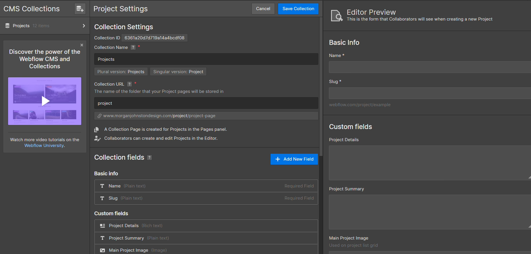
Separate repeatable content from page-specific blocks
Use this as a working filter.
| Figma Element | Webflow Target | When to Use |
|---|---|---|
| Header, footer, promo bar | Reusable symbol | Pattern appears on many pages, edited in one place |
| Blog card, case study card, product tile | CMS collection item | Content repeats, but text and media change per entry |
| Hero with specific messaging | Page section | Layout is close to unique, copy is page-specific |
| Pricing tiers, feature grids, testimonial sets | Component with variants | Structure repeats, a few fields change |
Figma has their own CMS ideas. Actually, reading the Figma Sites CMS guide before mapping is a good idea as it explains the behaviors of collections, items and lists in Figma. Once the mental models are aligned, mapping becomes easy.
Set the rules before anyone builds
Set the breakpoint up front. Common Webflow defaults are mobile set to 479 and below, tablet portrait set to 767 and below, tablet set to 991 and below, and desktop set to 992 and above. If there are no design decisions at these widths, the developer will make design decisions. This creates drift.
The same is true for naming components. Consistent naming, regardless of what convention is used Client First or otherwise, is very important. The AI tools that are supposed to assist handoff, including agent workflows through the Model Context Protocol, cannot assist if they cannot parse the structuring of the file. Inconsistent naming leads to both humans and agents getting it wrong.
Team structure is important too. One project needs sustained design and QA support alongside build work, so we have seen teams use services like Virtustant for offshore staff to keep work on documentation and asset preparation done to avoid pulling senior designers from the next project. Each service is different, but the principle is the same: a system-first handoff relies on someone whose job is the system, not just the pixels.
Want the same read on your own interface? We do a free design teardown of one key page. Request a teardown.
Rebuilding Interactions and Animations by Hand
Many teams still think hover states, scroll reveals, and page transitions will all be done by the plugin. They will not. The structure will be there. Everything else has to be built within Webflow, including motion and detail states.
This means that interaction specifications have to be done in Figma before any build can happen. Describe the details of the trigger, the motion, the easing, and the final state. If when interacting with a component the element changes, describe in detail what changes: the value or token of the background, the text color, the value or token that describes the change in the element’s position, and the duration of the change. Not “feeling interactive”.
The same attention to detail applies to motion triggered by scroll. Start, stop, fire, repeat, stance, and direction need to be described. Page transitions require sequencing. Leaves before, enters after. URL changes before, after, during. These are all decisions that the plugin cannot make for you. Write the motion spec as though someone else is going to do this without asking questions because they will.
Write the motion spec as if someone else has to recreate it without asking follow-up questions, because eventually, they will.
The upside of executing this well is that the interaction becomes reviewable. Once everyone knows what it is supposed to do, QA can catch the moment it stops doing it. Teams who skip this step typically end up spending far more time rebuilding the same animation 3 times: in a design review, during development, and in launch QA.
When to Choose Webflow, and When Not To
Not every project is suitable for Webflow. If the site consists of primarily marketing and editorial pages with relatively simple user interaction, then in most cases the Figma to Webflow workflow is the faster approach. If the project involves user authentication, real-time interactions, complex application logic, or heavy integrations, a custom build in Next.js, for example, is likely a better option in the long run.
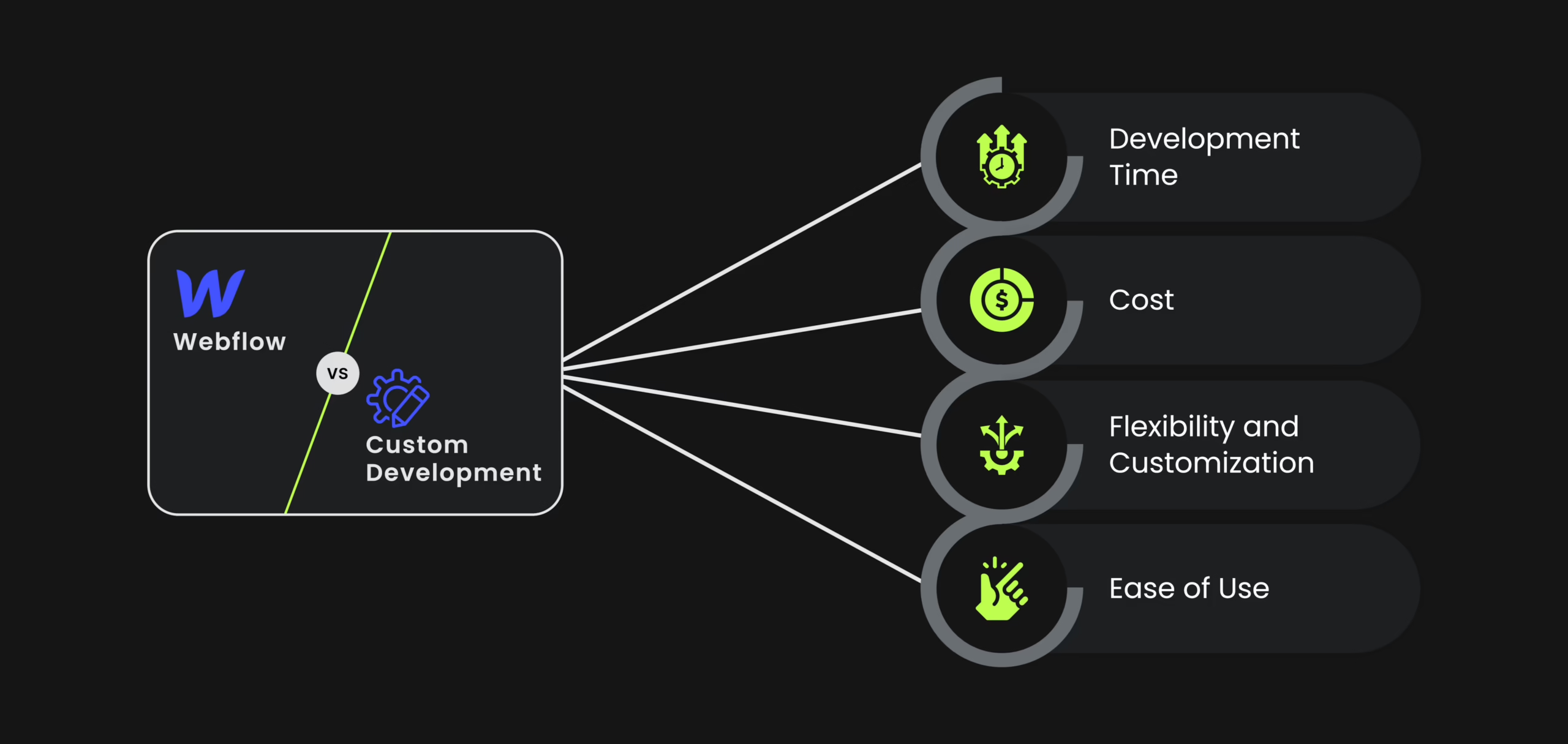
This isn’t a matter of personal preference. It’s about what the site is going to be tasked with post-launch. A solid Webflow site can easily support a growing marketing effort for a significant amount of time. A Webflow site that is asked to do product work typically starts to cause scope creep, and people end up working with a custom code implementation that no one wants to maintain.
The Webflow community has slightly more critical reviews now, noting that innovation and development occur more quickly elsewhere. This is reasonable, but we shouldn’t take it as a signal to make a sudden switch when in the middle of a project. Analyzing each project on its own merit, anyway, is what we should always do. This was the case when we made our choice to use SingularityHub’s publishing platform. Of course, the publishing platform offering new AI features would have been incredible, but the adoption of a design system and mapping it to a CMS was the more important consideration. This is likewise true for Webflow.
If you are analyzing this decision as part of a larger project, like a larger site, our website redesign checklist addresses the failure modes which usually determine if a rebuild is worthwhile.
A Working Handoff Checklist
Prior to the export, the Figma file uses auto layout, semantic component names, and design tokens which Webflow aligns with variable naming. We have agreed on breakpoints. Each repeatable pattern is a component. Every interaction has a written spec. All vectors are marked for conversion to SVG. Draft pages are clearly separated from production screens.
When importing, the developer begins detail work after structure is placed. This means interactions and edge cases are prioritized over pixel value spacing and typography. Pixel matching should be the last concern.
If you’re curious about how far you can take the visual design side of a project after you’ve nailed the system, check out creative website design sources for some ideas. This resource helps you distinguish between visual design elements and design that requires a lot of complexity; that distinction helps determine whether a project stays maintainable.
Usually, a handoff feels like a translation problem as opposed to a system problem, and that’s typically when external teams come in. Our UI UX design services and product design services target this specific concern: ensuring that the design that gets approved can be built, on the platform the team selected, without a month of additional work that was not accounted for. That’s what makes this process worth the effort before people start working in Webflow.
Sitting on a redesign you keep postponing? Let’s talk. Free 30-minute call, no pitch.

Hossein Karami is a senior frontend web developer at Refact, building the interfaces and user-facing experiences of the studio’s products. His work spans React-based applications, product UI, performance-focused implementation, and the integrations that connect frontend experiences with the systems behind them. Hossein works across the full stack when needed, bringing together design, usability, and engineering to create products that feel clean, responsive, and reliable. At Refact, he helps turn product ideas and interface concepts into polished digital experiences that users can actually work with.
More from Hossein Karami

